A few weeks ago, I had an AI script my video captions for an entire week. The text was flawless, grammatically perfect—and totally lifeless. Crickets in the comments section. It wasn't until I went back and manually added a slightly embarrassing, quirky detail the AI had scrubbed that people actually started engaging. That version finally got views. Then the views just sat there, because tapping my bio link landed people somewhere with no obvious next move.
That gap is what a faceless video landing page is built to close. Stick with me and you'll know exactly what to put on one, and in what order, so a view becomes a click and a click becomes one real action instead of leaking away.
What a faceless video landing page should do
Your video has one job: stop the scroll. The page your link points to has a different job, which is turning that half-second of interest into a single action you actually care about. So the page isn't a mini-site or a tidy list of everything you do. It's one screen built around one thing.
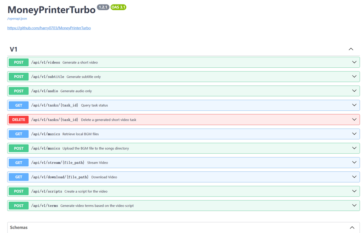
If you're producing faceless content at volume, you're probably assembling it fast. A tool like MoneyPrinterTurbo can take a keyword and hand back a finished short with script, voiceover, subtitles, and clips, all in one pass.
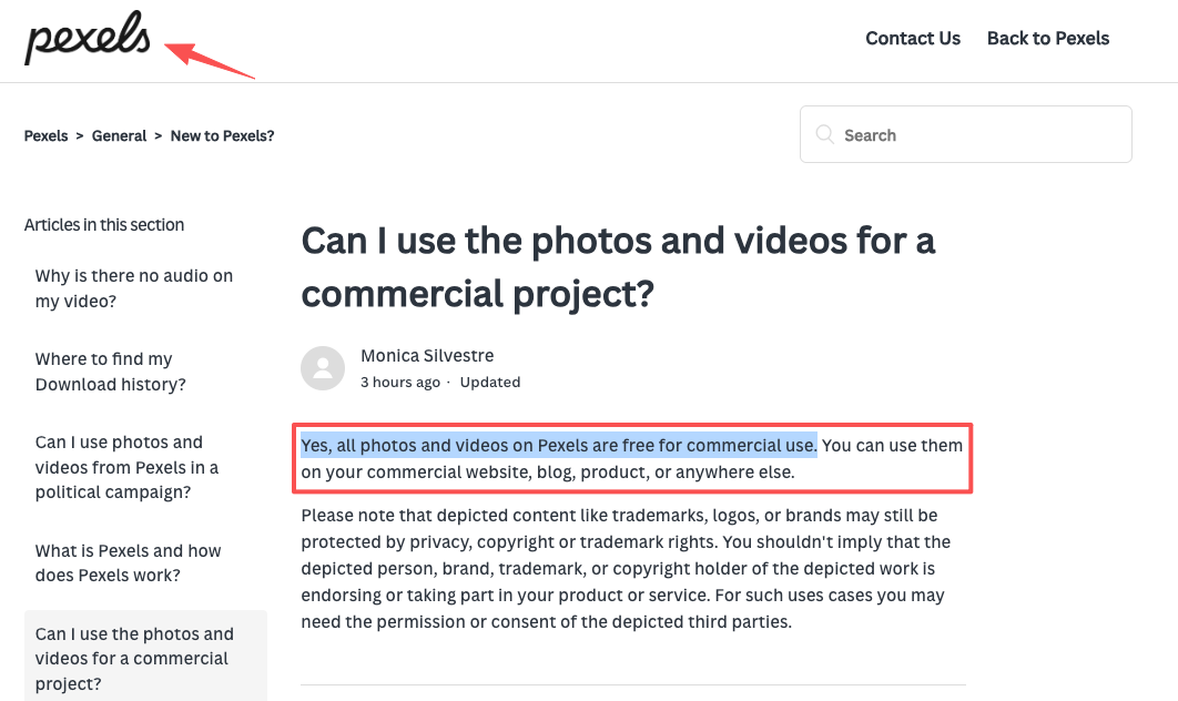
A lot of that B-roll comes from free stock libraries. Pexels footage, for example, is free for commercial use and doesn't require attribution, with a couple of limits I'll come back to. The point is that you can ship ten videos in an afternoon, and every one of them still dumps traffic onto the same weak destination.
So before you design anything, write down the one action. Not five. One. Join the newsletter, book a call, grab the free template. That single choice decides what every other piece of the page is allowed to do.
Map the video viewer journey before designing the page
You can't lay out the page until you know the headspace someone's in when they tap. A short-form viewer is impatient, half-distracted, and about three seconds from bouncing. Design for that person, not for a patient reader.
Watch, click, understand the offer, and take one action
Picture the four beats in order. First they watch a twenty-second video about one narrow thing. Then they click, and here's where reality bites: on most platforms the only clickable path is your profile link.
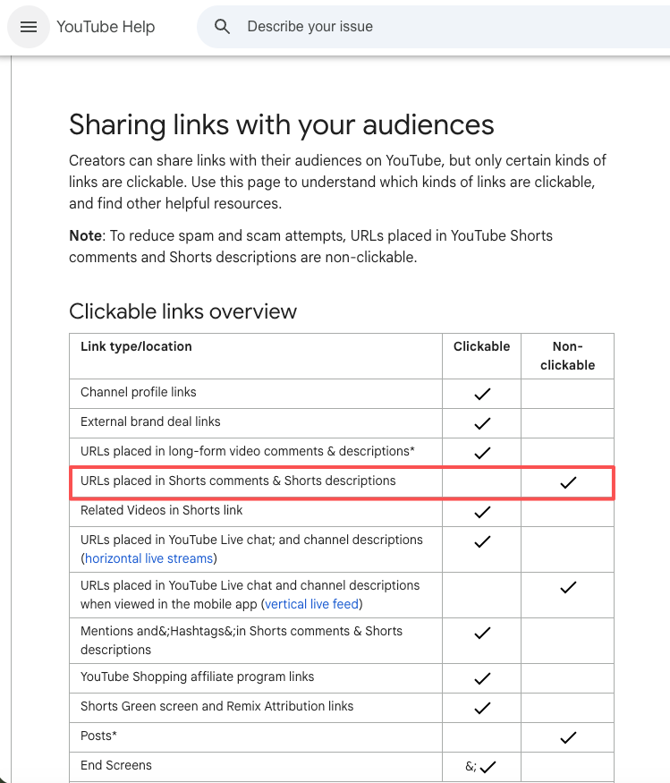
Think about YouTube Shorts: links in the comments or descriptions are just dead text. Viewers actually have to detour to your profile to find anything clickable. Instagram and TikTok are just as stingy, usually handing you exactly one bio slot. TikTok might even make you hit a follower count or switch to a business account first. Platform rules change constantly, so keep an eye on them.
That fragile click is exactly why the page has to pay off instantly. Within a second of landing, they need to understand the offer. The top of the page should echo the video they just watched, same topic and same promise, so they feel like they're in the right place.
Then comes the only thing that matters: take one action. One button, high on the page, saying the obvious next step.
Your move here: write your page's top line to match your video's hook almost word for word. If the video said "three b-roll tricks," the page shouldn't open with "Welcome to my world."
Page sections for AI video creators
Video context, offer, CTA, lead form, social proof, and contact options
Here's the running order I'd give any AI video creator building this for the first time. A context line at the top that mirrors the video. The offer, in one plain sentence about what they get. One CTA button, not a row of them.
Under that, a short lead form of two or three fields at most, because every extra field quietly kills replies. Then light social proof, like one real screenshot or quote (real, never invented). And contact options at the bottom for anyone who'd rather just message you.
Skip the heavy website builders. You really just need a single, straightforward card. Start with the exact same hook from your video, drop in the clip itself, add one clear "Work with me" button, and slide a short inquiry form right below it. Three fields tops.
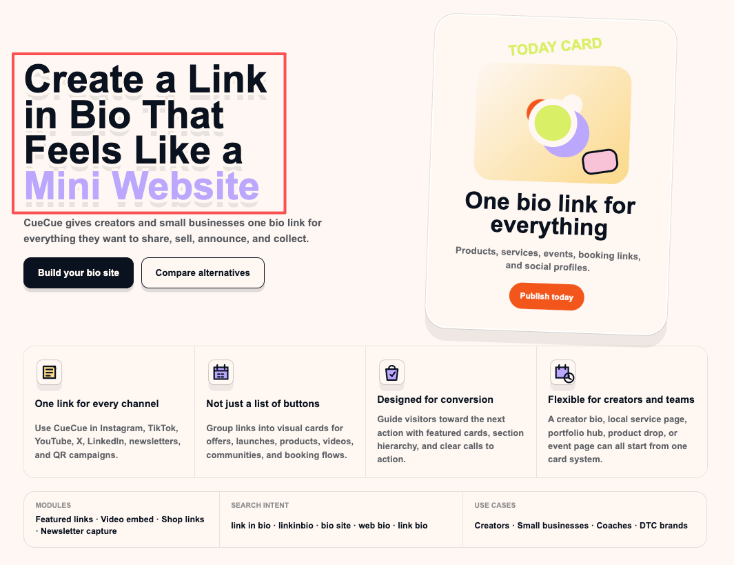
A link card like CueCue is one way to put that together and point your bio link at it, while your videos keep living on TikTok, Reels, or Shorts.Build the offer and the CTA first. Add proof and contact options only if they help the one action, and cut anything that competes with it.
What to avoid when using AI video traffic
The most common mistake is the one I made for ages: pointing every video at my profile or homepage and wondering why nothing converted. A profile is a hallway. People need a door with a sign on it.
Close behind that is the everything page, where you paste in all twelve links you own. That feels generous and it's actually paralysis. More options means fewer decisions, which means people leave without doing anything.
Watch the licensing, too. Stock clips feel consequence-free, but they aren't a blank cheque. Pexels allows commercial use, yet you can't imply that a person or brand shown in a clip is endorsing you, and you can't resell the raw footage as-is.
If your faceless niche recycles other people's clips or music, that's a separate rights question, and you shouldn't build a paid offer on footage you don't actually have the right to use.
Then there's fake proof. Slapping "Trusted by 10,000 creators" on your page when your actual user count is three is a terrible idea. People spot fake social proof instantly, and it ruins your credibility for the rest of the pitch. Just starting out? Show behind-the-scenes of your process instead of faking the numbers.
Your move today: open your current bio link and tap it like a stranger who just watched one of your videos. If the next step isn't obvious in about one second, that's the thing to fix first.
So where does this leave you
You don't need a bigger setup, and you definitely don't need a real website to catch video traffic. More pages won't fix a traffic leak. It all boils down to what visitors actually do once they land on that single, crucial screen. Decide exactly what action you want your next video to trigger, and design a page that does nothing else but push for that click.
FAQ
What is a faceless video landing page?
It’s the single screen sitting behind your bio link. No personal branding or fluff—just one highly focused offer (like a free template or newsletter sign-up) and one button.
How should AI video creators handle their bio link?
Since platforms only give you one link, send all traffic to a dedicated destination you can update on the fly. Point it to a custom page matching your latest video hook, rather than dumping viewers onto a generic homepage.
Will a landing page actually get me more leads?
Yes, by cutting out the clutter. A raw profile link gives people too many choices. A focused page gives them exactly one clear path to take, which naturally boosts the chances they’ll actually follow through.
Action page vs. full website: which do I need?
Need someone to book a call or grab a download right now? Use an action page. Need a blog, deep search presence, or an e-commerce store? Build a full website. For most creators, a missing next step is the real bottleneck, not a lack of web pages.
About this content
- Written by
- Mia Anderson, UGC Creator · Content Creator
- Reviewed by
- CueCue Team, Editorial review desk
- Last updated
- June 9, 2026
- Editorial standard
- CueCue articles are written for practical use, checked for clear sourcing, and updated when product or policy details change.