My first real giveaway collected entries through a Google Form that felt like filing taxes. Name, email, address, three more boxes nobody wanted to fill in on a phone. I watched the numbers: people opened it, scrolled, and left. The prize was good. The form wasn't. A giveaway landing page would have done the job a Google Form can't, because it puts the rules, the entry, and the share button in one place built for a thumb. That's what this is about. By the end you'll know what goes on the page, how the mobile flow should run, and which risks to sort out before you post anything at all.
What a giveaway landing page needs
Strip it down. A giveaway page has exactly one job. It takes someone from "ooh, I want that" to "I'm in," and it does it without making them stop to think. Everything on the page either pushes that move along or gets in its way.
Three things have to be obvious in the first second. What the prize is. How you enter. When it closes. If a visitor can't spot those without scrolling, a chunk of them is already gone, before they even worked out what you were offering them.
Then the part most people skip: where the entry actually goes. A comment is not a record. If you're collecting emails to notify a winner or build a list, you need real consent to use those emails later, not just a box someone typed into once. The rules on that vary by region and they change, so treat your own regulator and your platform's settings as the source of truth rather than a blog post. The UK's ICO has plain-language guidance on marketing consent that works as a decent model wherever you happen to be. Get this part right and your giveaway leaves you with a real list, not a pile of comments. That's the difference between a fun post and a lead capture page that keeps working after the winner's announced.
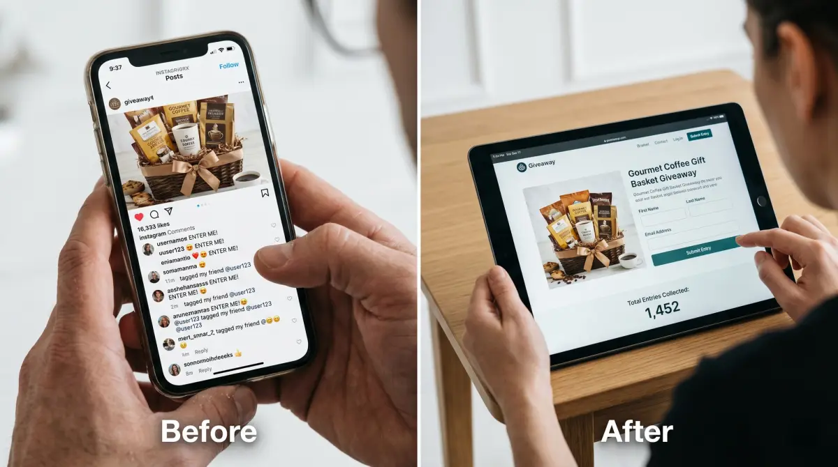
Build the mobile campaign flow
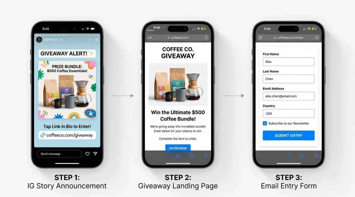
Most creator giveaway entries come from a phone, through one tap from a story or a bio link. So build it as a mobile campaign page, not a desktop layout you'll never actually see it on.
Social post, landing page, and entry action
The flow has three beats. The social post creates the want and sends people somewhere. The landing page holds the prize and the rules. The entry action is the one thing you actually need them to do. Leave an email. Follow. Tag a friend. Whatever it is, pick one and stay with it. A page that wants an email and a follow and a tag and a story share is really four pages in one trench coat, and your entry rate slips a notch with every extra ask you stack on.
Keep the top of the page doing the heavy lifting. Nielsen Norman Group's research on what sits above the fold is blunt about this: people decide whether to keep going based on what loads first, so the prize and the entry button belong right up top, not three scrolls down where most thumbs never reach. Put the full rules lower. Put the one action where a thumb naturally lands.
As an example you could build, a card tool like CueCue can host this page using its form and lead-capture modules, so the prize, the rules, and the entry all sit on one mobile page. Check that whatever tool you pick lets you export the entries, since owning that list is the whole reason you're not running this in the comments.
One mistake I made early on. I buried the entry under a long paragraph about how excited I was for this collab. Nobody entered until I flipped it. Prize and button first, the story after.
Giveaway landing page sections to include
Here's a working set of sections. You don't need every one, but pick from this list instead of starting from a blank screen.
- Prize, stated plainly, with a photo
- How to enter, in numbered steps
- Deadline with the date, time, and time zone
- The entry form or action itself
- Full rules and eligibility, linked or further down the page
- Winner announcement plan, so people know when and where
That deadline line pulls more weight than you'd guess. A fuzzy "ends Friday" just invites time-zone arguments and last-minute squabbles. A specific "closes Friday at 9pm ET" puts all of that to bed before it starts, and it's the small touch that makes a casual giveaway look like an organized person ran it.
The entry action deserves its own callout. Make it the single most obvious thing on the page. NN/G has a whole study on how a vague "get started" button drops people into a confusing flow and loses them, which is exactly what a cluttered entry step quietly does to a giveaway. One clear button. One clear next step.
Risks to handle conservatively
This is the part nobody enjoys and everybody needs. I'll keep it high-level, because the specifics change constantly and I am very much not your lawyer.
Platform rules, disclosure, and eligibility
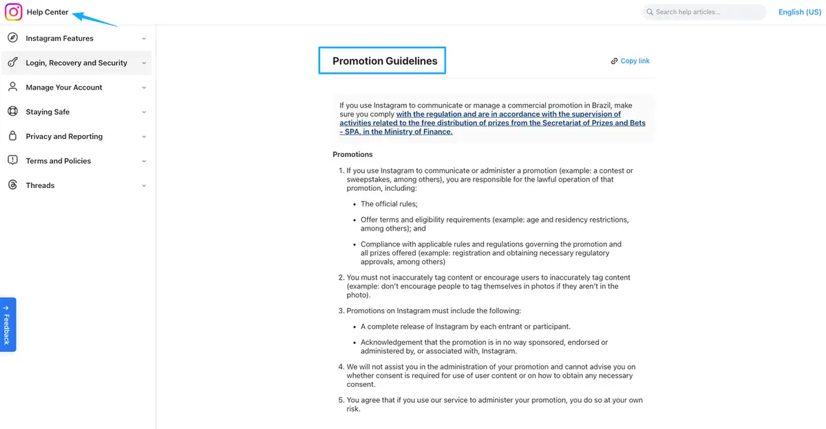
Platform rules. Every network runs its own promotion rules, and those shift around. So before you post, go read the current official version, Instagram's promotion guidelines for instance, instead of just copying whatever some big account pulled off last month. Their move might already break the current rules.
Disclosure. If a brand is paying you or handed you the prize to run the giveaway, that's a material connection, and you disclose it clearly. The FTC's endorsement guidance says it straight: put the disclosure with the post itself, in plain words, not shoved to the bottom of a tag pile nobody scrolls through.
Eligibility. Decide who can enter, by age and by location, and write it down before you launch instead of after someone questions it. Collecting data, or running across regions? Then check the current official docs for whatever platforms and rules apply to you. And when something's murky, the safe move is to simplify or ask, not to guess and cross your fingers.
When a campaign page beats a social post
A post is great at reach. It's terrible at memory. It scrolls away, the rules get lost somewhere in the caption, and the entries scatter across comments you can't export or even count properly. I once spent a whole evening scrolling a comment thread trying to number entries by hand, lost my place twice, and still wasn't fully sure I'd counted everyone fairly by the end.
A campaign landing page fixes the part the post can't. It keeps the rules in one stable place, collects entries you actually own, and stays live while the original post sinks down the feed and out of sight. Use the post for attention. Use the page for everything that has to outlast the first day.
That said, if your giveaway is tiny and casual, a quick comment-to-enter post might be all you need, and that's fine. The page earns its place the moment you start caring about the list, the rules, or being able to prove the draw was fair.
You've already done the hard part
You're good at the part most people find hard, which is getting people to actually want the thing you're giving away. Don't let that want leak out into a comment thread you can't do anything with later. Spin up one giveaway landing page, put the prize and the entry right up top, and let every share point back to it, so a share turns into an action instead of a lost comment. You've got this.
FAQ
What is a giveaway landing page?
A single mobile page that holds your prize, your rules, and your entry action in one place, instead of scattering them across a caption and a comment thread. The post brings people in. The page is where they actually enter, and where you keep a record you can use later.
How do you make a simple giveaway page?
Start from a template, never a blank screen. Drop in the prize, your entry steps numbered out, a deadline with the time zone spelled in, the entry form, and a link to the full rules. Keep that one action obvious, and shove everything else out of its path. You can have a rough version up in a single sitting.
What platform rules should creators check?
Whatever the network you're on asks for right now. Each platform runs its own promotion guidelines, and they keep getting updated, so pull up the official version ahead of each launch rather than trusting some screenshot from last year. Check your local promotion and data rules while you're at it. And when you're not sure, simplify or ask.
When is a campaign page better than a social post?
Whenever the rules, the entries, or a fair draw actually matter to you. A casual comment-to-enter post is fine for something tiny and low-stakes. The moment you're collecting emails, proving a draw was fair, or running anything a brand is attached to, the page is worth the few extra minutes it takes.
About this content
- Written by
- Mia Anderson, UGC Creator · Content Creator
- Reviewed by
- CueCue Team, Editorial review desk
- Last updated
- June 23, 2026
- Editorial standard
- CueCue articles are written for practical use, checked for clear sourcing, and updated when product or policy details change.