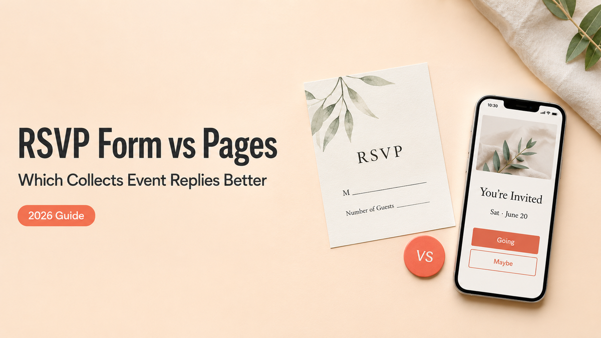
The last time I collected RSVPs with a Google Form, I built it in about four minutes and then sat there feeling like I'd handed my friends a tax return. Name. Email. Plus-one, yes or no. Dietary notes. It worked. People answered. Nobody opened that thing and felt invited, though. They felt processed.
That's the gap I want to walk through. A Google Form RSVP template is genuinely great for some events and quietly wrong for others. What decides it isn't how fast you can build the form. The thing that moves a guest from seeing your event to actually responding is what loads on their screen the second they tap your link. By the end of this you'll know which one fits the event you're planning right now.
Short version
If your guests already know you and you just need a head count, a Google Form is the right call. Done in minutes, free, no learning curve.
If your guests need to understand the event before they commit, or you want them to do something after they respond, a mobile RSVP page carries more. Same response, more context, one screen.
Most of this comes down to that one question: what does the person see when they tap?
When a Google Form RSVP template is enough

A Google Form earns its spot when the event is simple and your guest list already trusts you. Think a team dinner, a recurring book club, a private workshop for people who signed up through you. They don't need to be sold on showing up. They just need to tell you they're coming.
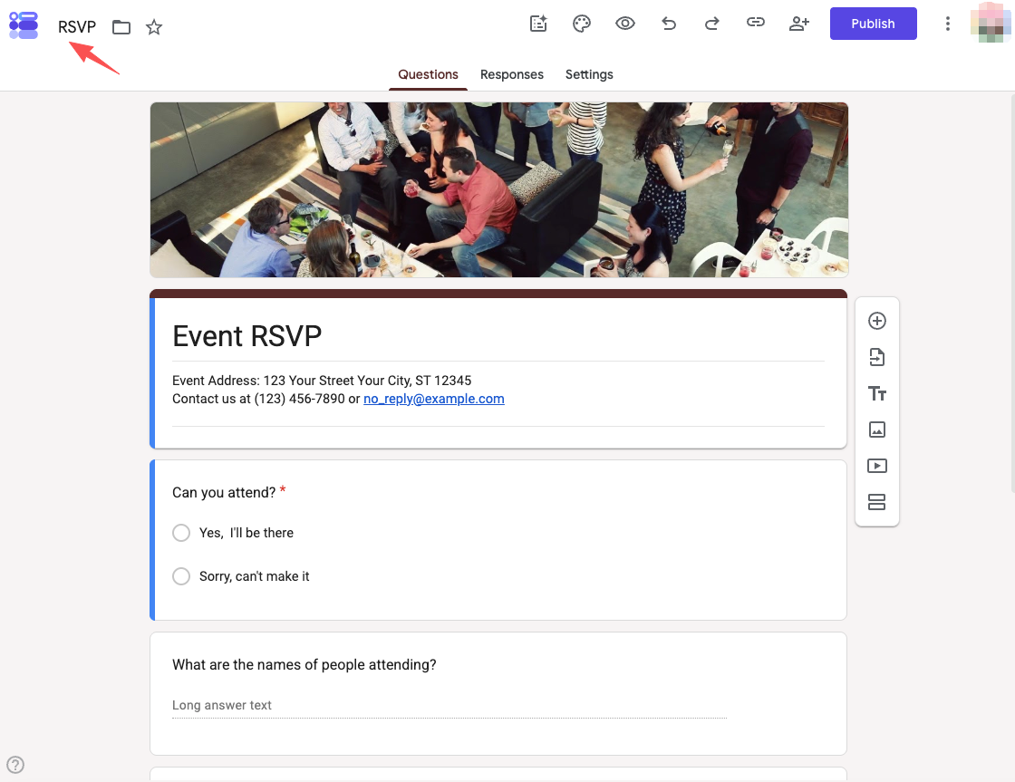
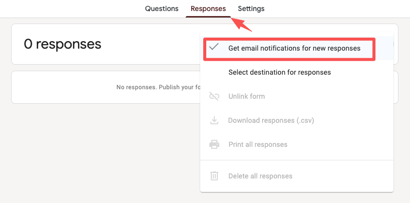
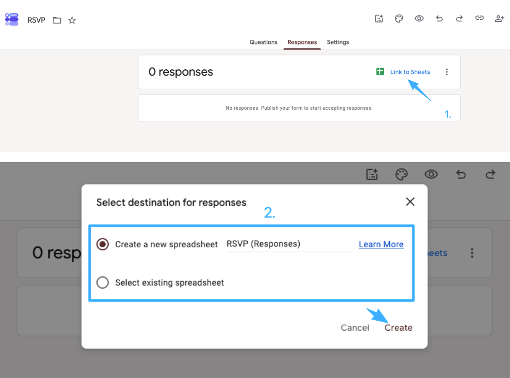
In those cases the form does everything you need. You drop in a few questions, set it loose, and the answers pile up cleanly. You can also switch on email notifications for new responses so you're not refreshing the tab all day, and every answer can be pulled into a sheet whenever you want it.
The friction is low because the expectations are low. Nobody's deciding whether your event is worth their Saturday. They already decided. The form is just the paperwork.
So if that's your event: open a template, add your three or four questions, share it, and move on. You don't need anything heavier.
Where a mobile RSVP page helps guests more
Now picture a different guest. They got your link from a story repost, or a flyer, or a friend who said "you should come to this." They've never heard of your pop-up. A bare form asks them to commit before they know what they're committing to.
This is where a page does work a form can't.
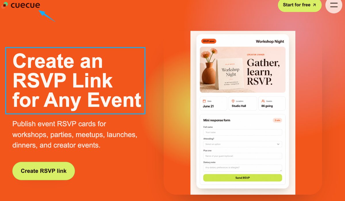
Event details, response, and next step in one view
A mobile RSVP page holds the whole event on one screen. The what, the when, the where. A line about why it's worth their evening. Then the response itself, right there, no second tab. And after they tap yes, the next thing they need: add it to their calendar, get directions, share it with the friend they want to bring.
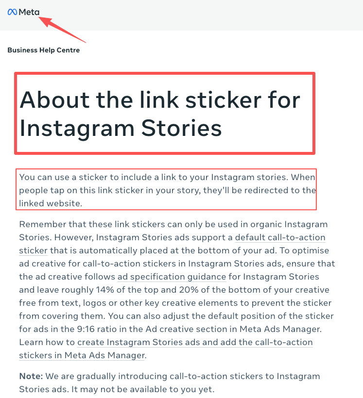
You share it the same easy way, too. Pop one mobile RSVP link into your Instagram Stories link sticker, and that single page carries the date, the vibe, and the RSVP together, instead of dumping people on a form that explains none of it.
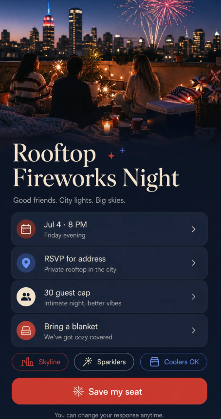
Here's something you could build, and I'll call it an example: a single-page RSVP card (CueCue is one tool that does this) with the event photo up top, three lines of detail, an RSVP button, and a "save the date" link tucked right under it. Cold guests land, understand, respond, and get their next step without leaving the page. That's the difference a page buys you: the reason to come and the way to reply, sitting on the same screen.
RSVP form vs RSVP page decision criteria
You don't actually have to guess. Run your event through three quick lenses and the answer usually picks itself.
Guest experience, host follow-up, and event complexity
Guest experience. Do your guests already know what the event is? Warm list, a form is fine. Cold or curious traffic, they need the context a page gives before they'll commit.
Host follow-up. What happens after they respond? If you just need the list, a Google Form pushes everything into a linked Google Sheet and you're set. If you want guests to do a second thing right after, a page keeps that next step in their hands instead of buried in a confirmation email.
Event complexity. A single yes-or-no head count leans form. A schedule to follow, a venue people might not know, limited spots, a "bring a friend" twist, any of that tips you toward a page, because it all needs to live somewhere guests can actually see it.
Tally two out of three toward "page," and you'll feel it on the day, in how few "wait, where is this again?" texts land in your phone.
RSVP mistakes that create friction
I've made most of these, so let me save you the reruns.
The big one is asking for too much. The Nielsen Norman Group's research on web form usability keeps landing on the same point: every field you cut lifts your completion rate. For an RSVP, you almost never need a phone number and a mailing address and a t-shirt size. You need to know who's coming. Cut the rest.
The second mistake is the dead end. Someone RSVPs, sees a flat "your response has been recorded," and that's it. No reminder of when it is. No way to add it to their calendar. They've already half-forgotten by the next morning.
The third one is the wall. The link dumps people onto something that doesn't say what the event even is, so curious-but-unsure people just close the tab. You felt the interest. You just didn't catch it.
Quick fix for all three: trim the questions, give every "yes" a next step, and make sure whatever you share actually explains the event before it asks anything.
Which option fits your event?
There's no single winner here, and I won't pretend otherwise.
Go with a Google Form RSVP template when the group is small and already knows you, the event's simple, and a head count is mostly what you're after. Fast, free, no fuss.
Go with a mobile RSVP page when your link is heading out to people who still need convincing, or the event's got details that won't squeeze into a form's gray header, or you want the RSVP to roll straight into the next action. Starting from an event page template instead of a blank form makes that a ten-minute job.
And honestly, plenty of hosts use both across the year. The book club gets a form. The launch party gets a page. Match the tool to who's tapping the link, not to what you used last time.
You've got the harder part handled
Here's the thing worth remembering: you've already done the difficult bit. You planned something people want to come to. Don't let a clunky link leak that interest out the bottom.
So your one move today: look at your next event, decide whether the people tapping are warm or cold, and pick the form or the page based on that single read. Warm and simple, make the form in four minutes. Cold or detailed, build the one page that turns every share into an action. Either way, you'll have it live before your coffee goes cold.
FAQ
What is a Google Form RSVP template?
It's a pre-built Google Form set up for event replies, with the usual fields already in place: name, attendance, plus-one, sometimes dietary notes. You copy it, swap in your event, and share the link. Fast and free. For the specifics on notifications, response privacy, and exporting your replies, check Google's current official Forms documentation, since those settings do get updated.
How is an RSVP page different from an RSVP form?
Think of where the response lives. A standard event RSVP form is a standalone list of questions. A page wraps that same response inside the actual event, so guests see the details, the date, and the next step alongside the box they're filling in. The form collects. The page collects and hosts the event.
When should a host use an RSVP page instead?
Whenever the person tapping might not already be sold. Cold story traffic, a flyer with a QR code, a forwarded link, a launch where the location and timing matter. If your guest needs to understand the event before they'll respond, the page does that lifting where a bare form can't.
What should guests see after they RSVP?
At minimum, confirmation that it worked, plus a reminder of when and where. Better still, a next step they can take immediately: add to calendar, get directions, or share the event with someone. A response shouldn't be a dead end. It should hand them the thing they need next.
About this content
- Written by
- Mia Anderson, UGC Creator · Content Creator
- Reviewed by
- CueCue Team, Editorial review desk
- Last updated
- June 15, 2026
- Editorial standard
- CueCue articles are written for practical use, checked for clear sourcing, and updated when product or policy details change.