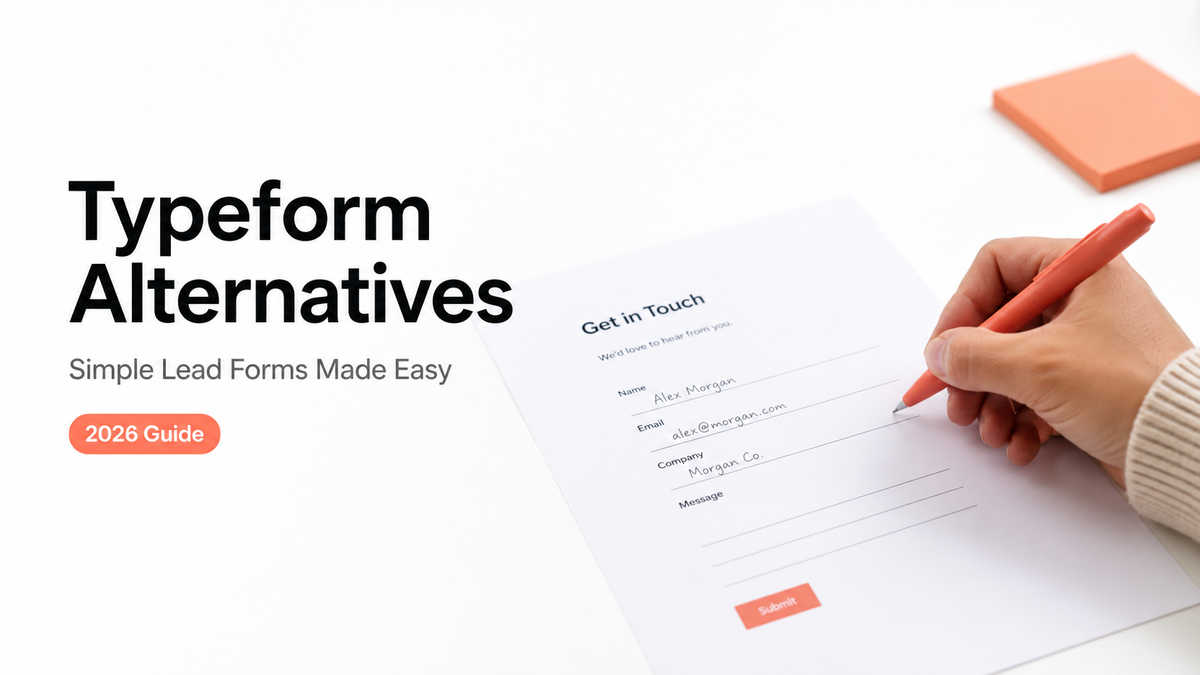
My first inquiry form had eleven questions. Eleven. I'd built it the fancy way, one question per screen with smooth transitions, because that's what a "real" creator form looked like to me at the time.
Then I watched a brand open it on their phone, get to question four, and close the tab. That was the afternoon I started looking at Typeform alternatives that didn't turn a small ask into a survey. What fixed it wasn't a slicker form. It was three fields on one card: budget, timeline, platform. By the end of this you'll know when a few-field lead form beats a full form builder, and where to put one so people actually fill it.
Quick take, if you're skimming:
- Most Typeform alternatives fall into two camps: other form builders, and action pages that simply hold a short form.
- Where the form lives matters as much as the fields. A form on a page someone already trusts gets filled.
- Keep the full form builder for quizzes, scoring, and conditional logic. Downgrading those to three fields just loses you data.
Why people search for Typeform alternatives
Most people don't go looking because the tool broke. They go looking because they're using a survey engine to do a one-line job.
A slick one-question-per-screen form earns its keep when you're running an actual survey, or some multi-step application. But for "tell me your budget and when you need this"? That's a lot of machinery to catch a one-line answer. So the want hiding behind most Typeform alternatives searches comes down to one of three things. Something lighter. Something cheaper. Or a contact form that sits right where your audience already taps, instead of parked off on its own separate link.
That last one is the part people underrate. You can have the prettiest form in the world. If it sits one extra click away from your bio, half your traffic never gets there. The fix is rarely a better form. It's a shorter form on a page that's already doing a job.
Form builder vs action page
These two things get treated as the same purchase, and they aren't.
A form builder makes the form itself: the fields, the logic, where the data ends up. An action page is where that form lives. It's a short mobile page covering who you are, what you do, and the next step someone should take, with the form as just one piece sitting inside it. For a real survey you mostly care about the builder. For a simple lead, the page around the form does half the convincing.
Plenty of Typeform alternatives are really just this distinction in disguise. Some are heavier builders. Some are lighter pages. Knowing which one you're shopping for saves you from buying survey software to collect a name and an email.
Complex survey vs simple lead capture
Picture two jobs side by side.
One is a customer-satisfaction survey with branching, where unhappy responders get follow-up questions and happy ones skip ahead. That needs a builder. The other is a brand wanting to send you a project. They give three things and hear back. No branching, no scoring, no thirty-question flow.
For the second job, a free option like Google Forms already collects responses fine. What it doesn't do is wrap that form in a page that looks like you and points to your work. That's the gap a simple lead form on an action page fills, and it's why "which form builder" is often the wrong first question.

Simple lead form use cases
Here's where the few-field approach earns its keep. A handful of real ones:
- Creator brand inquiries. Three fields, budget and timeline and platform, qualify a collab before you've typed a single reply. That one change is what emptied my DMs of the same three repeated questions.
- Coach or consultant discovery requests. Name, what they're stuck on, and a rough timeframe is enough to decide whether a call makes sense.
- Local service contact or booking. A short "what do you need and when" form, sometimes paired with a booking link.
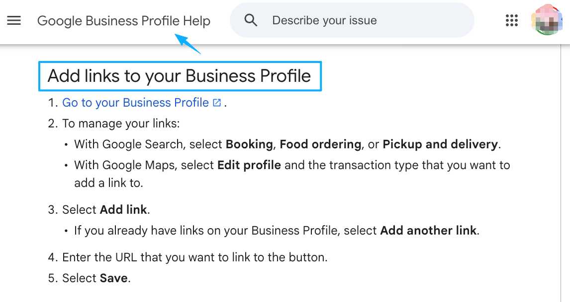
For that last one, businesses with a Google listing can also wire a booking or contact action link straight onto their profile, so the form isn't the only path in.
Then there's placement. These days Instagram lets you stack up to five links in your bio, and a QR code pulls off the same trick offline. Either way you're after one thing: a single tap to a page that holds your short form. Not a scavenger hunt across five open tabs.
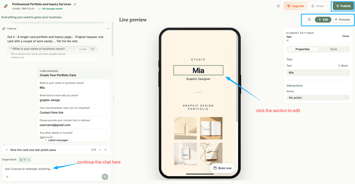
Here's something you could build, and I'll call it an example up front: one card with a couple of work samples, a line reading "rates on request," and a three-field inquiry form, shared as a single link or one QR. CueCue is one way to make that card, an action page that holds the form rather than a form builder with branching logic. The form stays short on purpose. The page does the rest.
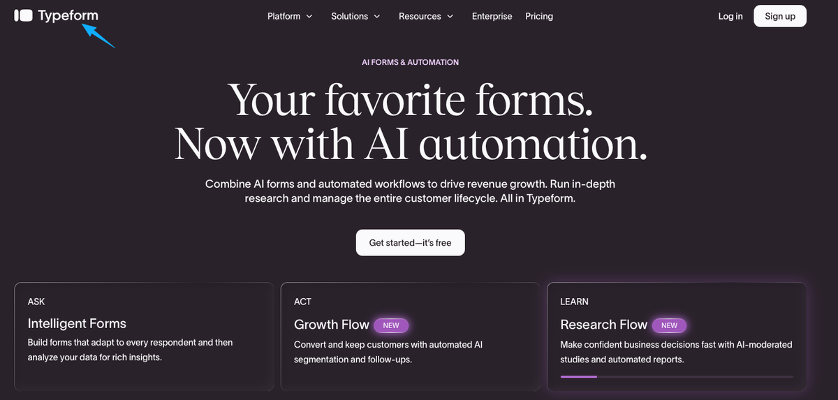
When Typeform-style tools still make sense
I don't want to talk you out of the right tool.
If you actually need conditional paths, a full builder is the correct call. Typeform's branching logic serves people different questions depending on what they answered earlier, and that's actually useful for surveys, quizzes, and multi-step qualification where each question hinges on the last. Scoring leads. Grading a quiz. Sending different responders down different paths. All builder territory, and three fields on a card can't fake any of it.
The test I use is blunt. If your form needs to think about the answers, keep the builder. If it just needs to catch a few answers and get out of the way, you're probably overpaying in both money and friction.
The mistake I see most often is the opposite of mine. People pick a powerful builder, feel they should use the power, and end up with a fifteen-field form for a job that needed four. The tool didn't fail them. The extra fields did. Whatever you choose, the field count is the number to defend, not the feature list.
Decision checklist for small teams
If a couple of you share the work, run through this before you compare Typeform alternatives any further:
- How many fields do you truly need? Write them down. If it's under five, you likely don't need a survey tool.
- Where will people fill it in? Most will be on a phone, coming from a bio link or a QR. A mobile form that opens fast beats a fancy one that loads slow.
- Where do the responses land? Check the tool's current docs for export and integrations before you commit, so a teammate can pull leads into your inbox, sheet, or CRM.
- Does it need logic? No branching, no scoring? A simpler tool wins. If yes, don't downgrade.
- Does the form need a page around it? A bare form collects data. A lead capture page also explains who's asking and why someone should bother.
That last question is the one small teams skip most. A form alone answers "what do you want." A page answers "why should I trust you with it," and that's usually what's actually leaking your leads.
One move, today: write down the three or four fields that really tell you whether a lead is worth your time. Put them in a short form, on a single page, sitting behind your bio link. Then when you size up Typeform alternatives later, you'll be judging them on that page and those fields, not on whoever ships the longest feature list. Start from a template, not a blank page, and you'll have it live before you've talked yourself into building anything bigger.
FAQ
What is a Typeform alternative?
Any tool you'd use instead, when a conversational survey builder is more than the job needs. Some are other form builders. Others aren't form tools at all, they're action pages that hold a short contact form, which is often the better fit for a single lead capture page rather than a full questionnaire.
How do simple lead forms work on mobile pages?
Picture a card that opens from your bio link or a QR code. The visitor sees a little context, then a few fields: name, a qualifying detail or two, how to reach them. They tap send, and the response lands wherever you set it. No separate app, no thirty-question flow, no detour off the page.
When is a full form builder better?
Whenever the form has to react to answers. Branching, skip logic, scoring, or quizzes all need that engine, and a tool like Typeform is built for exactly that. If your questions change based on earlier ones, stay with the builder rather than forcing it into three fields.
What should small teams check before choosing a form tool?
Start with field count and where the form will be filled out, then confirm the boring parts: how responses export, what integrations exist, and any plan limits. Those specifics change over time, so pull up each tool's current official docs instead of trusting a number you saw in some comparison post.
About this content
- Written by
- Mia Anderson, UGC Creator · Content Creator
- Reviewed by
- CueCue Team, Editorial review desk
- Last updated
- June 11, 2026
- Editorial standard
- CueCue articles are written for practical use, checked for clear sourcing, and updated when product or policy details change.