When did a brand last actually book you straight from your bio link? Not tap it. Book. I ask because I lost a paid collab once to a creator whose page just worked. Hers wasn't fancier than mine, just clearer about one thing: how to actually hire her. A few samples, a line on who she was, one obvious button. Mine was a neat list of links that led everywhere and nowhere.
Hi, I am Mia, and that's the lens I want to use here. If you're weighing Milkshake vs Linktree for your creator bio page, this will help you pick by what you need people to do, not by which one looks nicer in a listicle. No crowning a single winner, because there isn't one for everybody.
Quick verdict by creator need
Short on time? Here's the gist. The Milkshake vs Linktree decision usually comes down to one thing: the shape you need your bio to be.
If you want a profile-style page that feels like a tiny branded site, with a story to swipe through, Milkshake leans your way.
If you want a fast, scannable list of links and nothing fancier, Linktree does that job cleanly.
If your main goal is one specific action, like an inquiry or a booking, neither a story nor a list is really built for that, and an action page is worth a look as a third option.
Pick the shape that matches your goal first. The rest is detail.
Milkshake vs Linktree at a glance
These two tools come at the bio link from genuinely different angles, and that's the whole story.
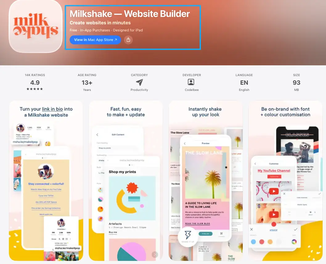
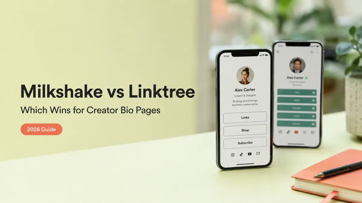
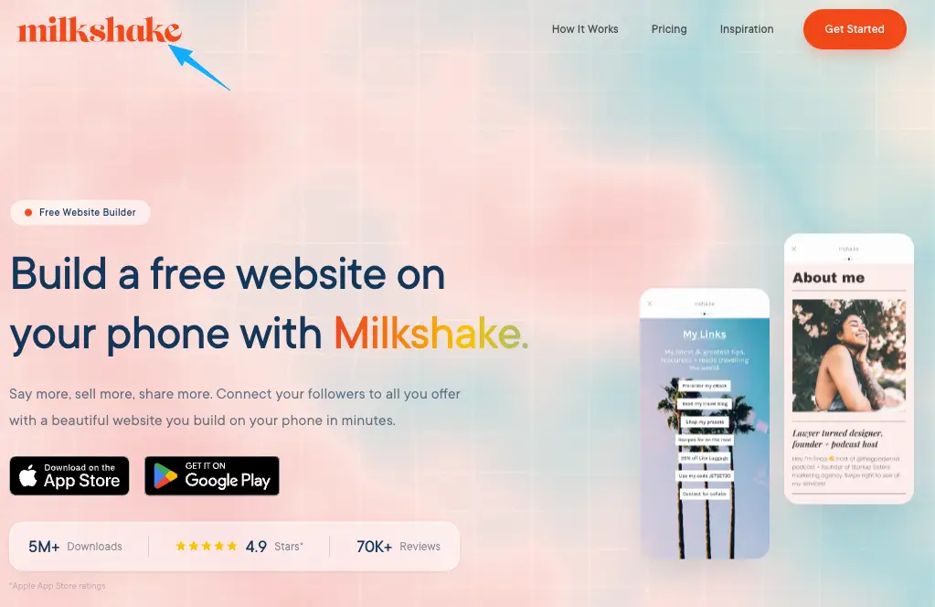
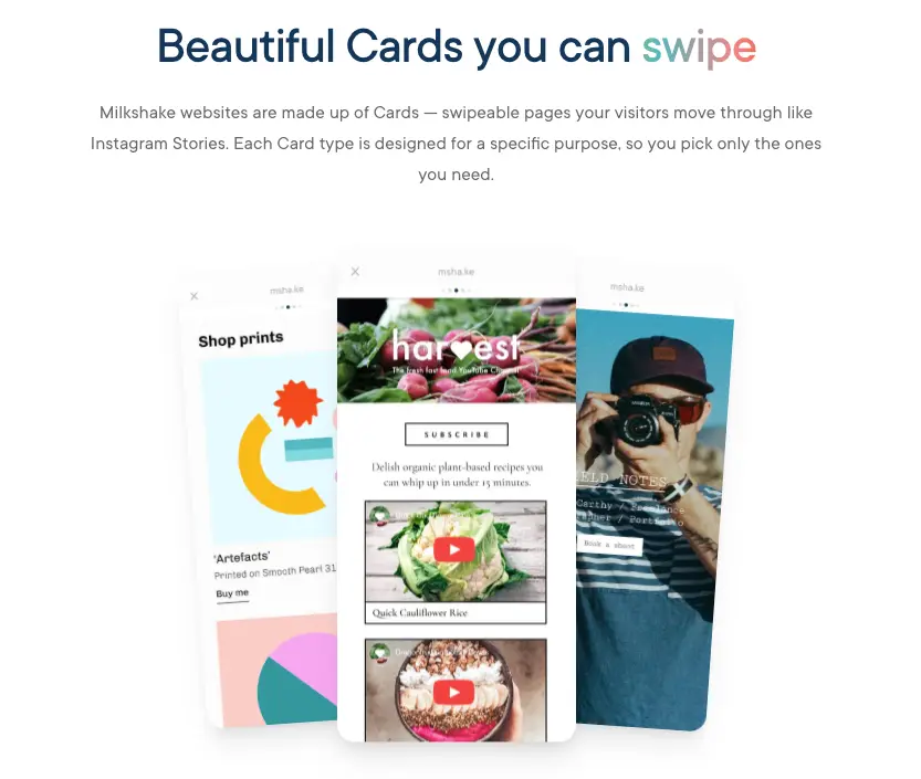
Milkshake is a phone-only app that builds what it calls a mini website out of swipeable cards. Visitors swipe through them the way they'd tap through an Instagram Story. An intro card, then an about card. Your links. A video. Maybe a mailing-list signup if you want one. The whole thing is built to feel like you, with templates and brand colors, plus analytics running in the background. The vibe is a personal magazine, not a menu. You can even run more than one of these from the same app, and a custom domain sits on its higher tier if branding matters to you.
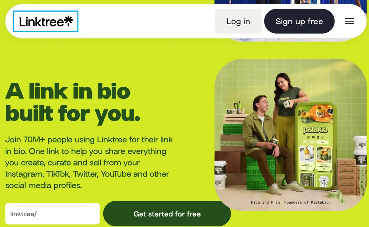
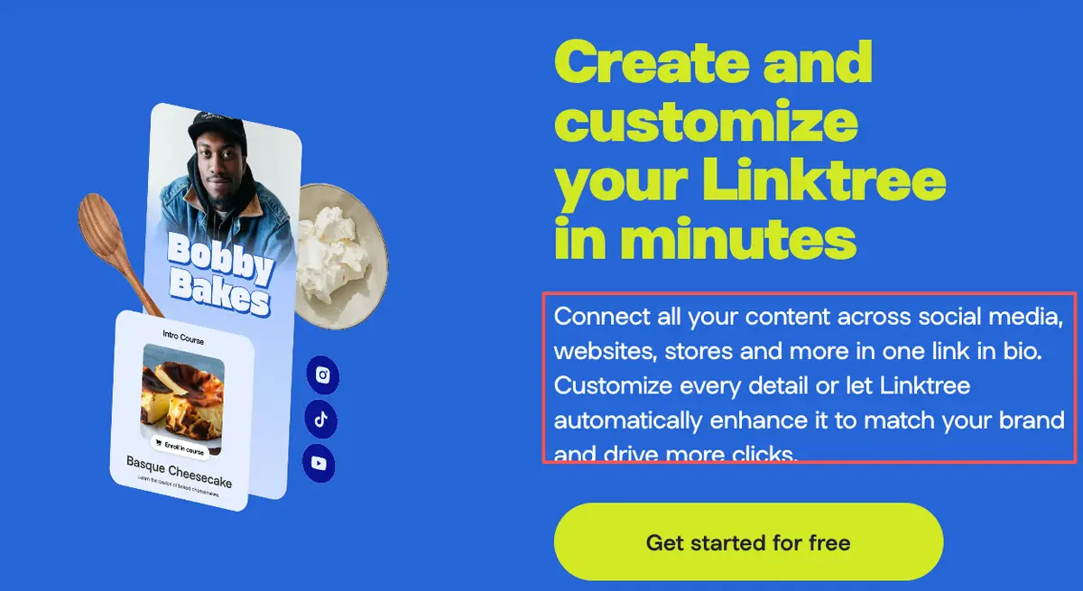
Linktree comes at it the opposite way. It's a single landing page that stacks your links into one clean, tappable list. Setup takes minutes. Easy to scan, and familiar to just about everyone. The richer stuff, like deeper analytics or your own domain, mostly lives behind paid plans, so check each platform's current pricing before you assume a tier covers what you need.
So one builds a swipey mobile bio site, the other builds a link list. That difference shapes everything below.
Key differences that affect creator actions
Both tools live behind your one bio link. The real Milkshake vs Linktree split shows up in what they do to the person who taps that link.
Mobile design, link flow, and conversion context
Design and feel. Milkshake's card format gives you room to set a mood: a full-screen intro, your story, your work, all styled. A link in bio on Linktree is more utilitarian, a branded list that gets people somewhere fast. Neither is wrong. One is a brand moment, one is a directory.
Link flow. This is the part that quietly shapes outcomes. On a swipeable mobile bio site, people move through cards, which is lovely for storytelling but can bury your most important link a few swipes deep. On a list, everything's visible at once. That sounds like a plus, until a dozen links all pull equal weight and nothing actually stands out. Studies on choice overload say as much — more options make people slower to act, and plenty of times they just don't act at all.
Conversion context. Here's the honest limit of both. A story-style page is built to express, a list is built to route. Neither is built around a single conversion, like capturing an inquiry. If your bio traffic mostly needs to do one thing, you'll feel that gap no matter which of the two you pick.
Your move: open your current bio and ask which matters more right now, telling your story or driving one action. That answer points you.
Where an action page fits as another option
If that "one action" thing kept nodding at you, this is for you.
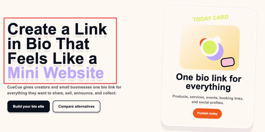
An action bio page is a third shape. Instead of a swipe-through brand story or a list of destinations, it's one focused page built around a single next step: an inquiry form, a booking link, an offer. The whole layout points at that one thing, with just enough context to earn the tap.
It's a different job than either Milkshake or Linktree is really chasing. You'd still put it behind the single link in your profile, same as the others. The difference is what loads. Here's an example you could build: a single action bio page (a tool like CueCue is one way to do it) with a short intro, two samples, and an inquiry form, so a curious brand can reach you without swiping or scanning a menu. It's aimed at a single reply, not a browse. That's the whole point.
Not everyone needs this. If you mostly want to look good and share links, the other two are simpler. But if you've been wondering why attention isn't turning into messages, this is usually the missing shape.
Which setup should creators choose?
I'm not going to hand you one answer on Milkshake vs Linktree, because the right pick really does depend on you.
Go with Milkshake if you want your bio to feel like a small, styled site, you create on your phone, and storytelling matters as much as links. The card format rewards creators with a look and a narrative to share.
Go with Linktree if you just need a reliable, recognizable list of links up fast, and you're not chasing one specific action. Low effort, and it gets the job done.
Reach for an action page when your bio's real job is catching inquiries, bookings, or leads — and you want the whole page aimed at that, instead of at a story or a list.
Plenty of creators even mix these over time. A list early on, a story-style page as the brand grows, an action page when the inquiries start. Match the format to your goal this season, not forever.
Your one move today
You already know your audience and you already make things they like. The only question left is what you want that attention to do once it taps.So answer just that, honestly, today: story, list, or one clear action? Then pick the shape that serves it and ship the rough version. Whatever you land on, make sure it turns every share into an action, not just a view someone forgets by the next scroll. Refine the look later, once the page is already catching the right people. Future-you, fielding actual replies, will be glad you started early.
FAQ
What is the difference between Milkshake and Linktree?
Format, mostly. Milkshake builds a swipeable, card-based mini site you make on your phone, styled to feel like your brand. Linktree builds a single page that lists your links for quick tapping. One leans toward story and design, the other toward speed and simplicity. For exact features and current pricing, check each platform's official site, since those change.
How should creators choose a bio page tool?
Start from the action, not the tool. Ask what you most want someone to do after they tap: read your story, jump to a link, or contact you. A story page suits the first, a link list the second, an action page the third. Pick the shape that fits that answer, then compare tools inside that shape.
When do creators need more than a link list?
Whenever the goal shifts from routing to converting. A link list is great for sending fans to your latest video or other socials. The moment you need one clear result, like an inquiry or a booking, a plain list starts leaking that intent, and a more focused page earns its place.
Which setup fits creator inquiries better?
A focused action page, generally. Stories and lists are built to express or route, so an inquiry can get lost in the swipe or the stack. A page built around a single contact path keeps that one job front and center. Whatever you choose, make the way to reach you the loudest thing on the page.
About this content
- Written by
- Mia Anderson, UGC Creator · Content Creator
- Reviewed by
- CueCue Team, Editorial review desk
- Last updated
- June 16, 2026
- Editorial standard
- CueCue articles are written for practical use, checked for clear sourcing, and updated when product or policy details change.