Type "best link in bio for creators" into Google and you'll get forty listicles, each one crowning a different winner. I went down that hole last year. The whole time, my own bio link had seven buttons stacked on it: my YouTube, a podcast I'd quit, an old blog, a newsletter that 404'd, and a couple of links I couldn't even remember adding. A brand clicked through to actually work with me once, and there was no obvious way to start. They just left.
That hole taught me the question itself is a little off. By the end of this you'll know how to pick the setup that turns bio traffic into actual leads, instead of chasing whatever tool topped this week's list.
Short version
There's no single product that wins this for everyone. The right bio link is whatever setup makes your most important next move obvious the second someone taps your link.
Need leads? Build around a capture form. Need bookings? Build around a calendar link. Selling an offer? Build around one product, not ten. The tool matters less than whether the page points at one clear action.
If you only change one thing today, cut your bio link down to the single thing you most need people to do.
What "best" means for a creator bio link
On those listicles, "best" usually means most features or biggest brand name. For a creator who needs leads, that's the wrong yardstick.
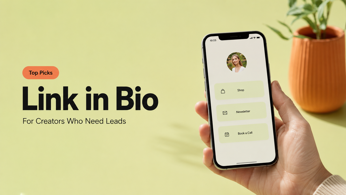
A bio link is the one tappable spot you get on most platforms. On Instagram, it's the link in your profile that people reach after your content makes them curious. That tap is a small window of intent. Someone liked what you made and wanted more. What they hit next decides whether that interest turns into a lead or evaporates.
So "best" here is narrower than the lists make it sound. The best creator bio link is the one that catches that intent and gives it somewhere to go. A page with twelve equal buttons doesn't do that. A page built around one action does.
Your move: open your own bio link right now and count the buttons. If you can't say which one is the point, your visitors can't either.
Match the bio page to the creator goal
Here's the part the ranking lists skip. There's no single best setup for every creator, because creators don't all want the same thing from a tap. The right one falls out of your goal, not out of a feature comparison.
Leads, bookings, offers, and brand inquiries
If you need leads, build the page around a short capture form. Not a wall of links with a form buried at the bottom. The form is the page. Ask for the two or three things you actually need, and skip the rest, because every extra field costs you completions. The Nielsen Norman Group's web form research keeps landing on the same point: shorter forms get finished more often.
If you need bookings, the page should lead straight to your calendar or an inquiry path. A coach or consultant doesn't need followers admiring a link list. They need a clean route to "book a call."
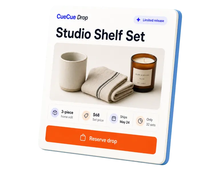
If you're pushing an offer or a product, feature one thing, not your whole catalog. A single drop on a clean offer page, with clear price context and a buy or inquire button, beats a grid where nothing stands out.
If you're fielding brand deals, make the collab path the loudest thing on the page. Portfolio, a way to see your rates, and one "work with me" button. That's the page I wish I'd had when that brand bounced.
Whatever your goal, pick it first, then choose the setup that serves it. The goal picks the tool, not the other way around.
What an action-focused bio page should include
Once the goal's clear, the build gets easy. An action-focused creator landing page just strips out anything that competes with the one thing you actually want people to do.
One primary action with enough context
The biggest mistake I see (and made) is offering too many equal choices. The Nielsen Norman Group's work on choice overload shows that piling on options makes people slower to decide, and sometimes makes them not decide at all. Seven buttons of equal weight isn't generous. It's paralysis dressed up as helpfulness.
So pick one primary action and let it dominate. Then give it just enough context to be trusted:
- A line on who you are and what you do, so a cold visitor isn't guessing.
- A bit of proof. Recent work, a logo or two you've collaborated with, a short testimonial.
- The one action, big and obvious: the form, the booking link, the offer.
- A quiet secondary path for the people who aren't ready yet, like a newsletter or a "follow for more."
Everything else is optional. If a link doesn't serve the main goal or build trust around it, it's competing with your call to action. Cut it.
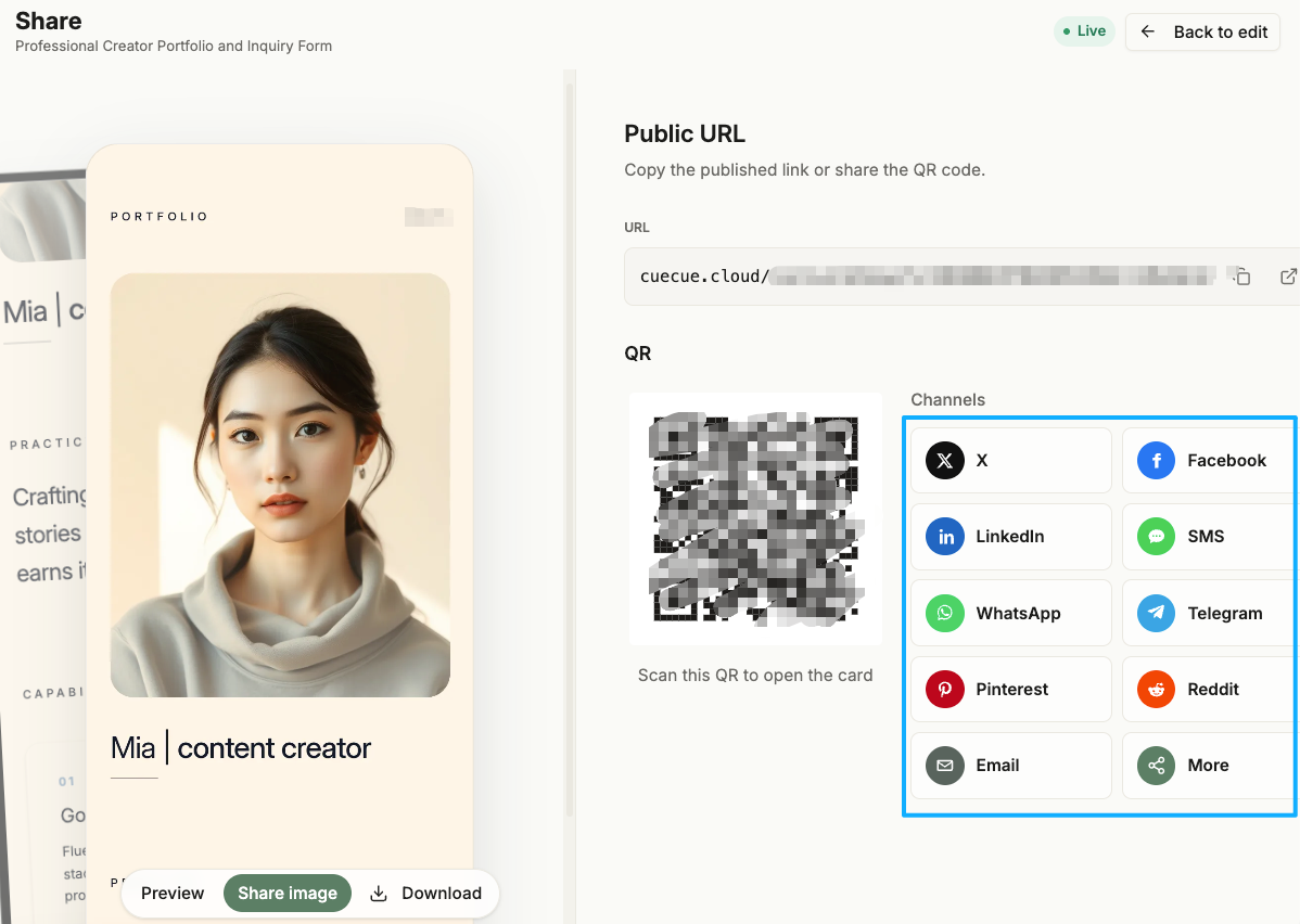
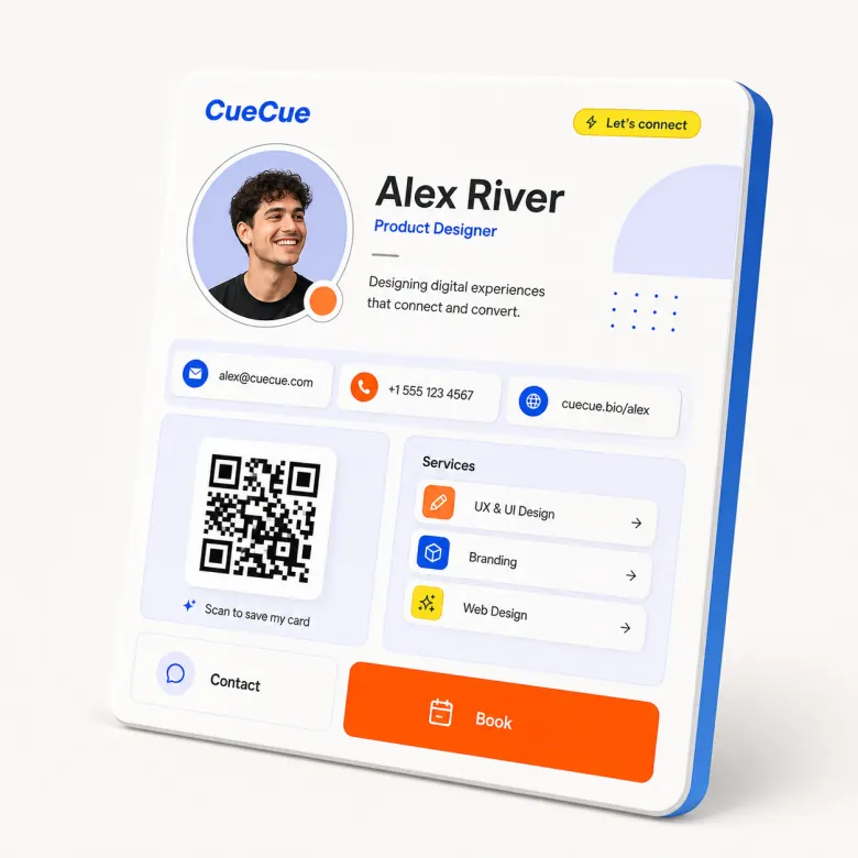
Here's an example you could build: a single-page creator card (a tool like CueCue is one way to do it) with your photo and one-liner up top, two pieces of proof, an inquiry form, and a small newsletter link underneath. Lead capture page, but it reads like you, not a generic Google Form. Cold tap lands, understands, and acts, all on one screen.
When a simple link list is still fine
I'm not going to pretend a plain link list is always wrong. Sometimes it's exactly right.
If your goal is mostly discovery, sending fans to your latest video, your podcast, your other socials, a tidy link list does that job. No lead capture needed. You're routing attention, not converting it.
A list also makes sense when you genuinely have several equally important destinations and no single action on top. A musician dropping tour dates, streaming links, and merch might not have one "primary" move at all, and forcing one would just feel fake.
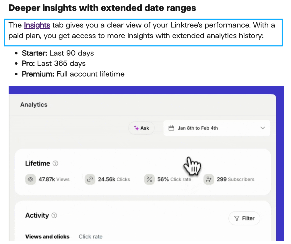
The richer extras on these tools, deeper analytics or your own domain, tend to sit behind paid plans, so check what's current on each platform before you assume the free tier covers you.
Quick, honest test: when someone taps, is there one thing you most want them to do? Yes means build an action page. No, just routing, means a clean list is fine. Match the format to the truth of your goal.
Creator selection checklist
Run your bio link through these before you call any tool the "best" one for you:
- What's the one action? If you can't name it in a sentence, fix that before picking a tool.
- Does the page show that action first? It should be the loudest thing, not buried.
- Is there enough proof to trust you? A cold visitor needs a reason in three seconds.
- Did you cut the dead links? The quit podcast, the 404 newsletter. Gone.
- Can you see if it's working? Even basic click data tells you what to change.
- Does it look like you? A branded page converts warmer than a generic list.
If you can tick most of these, the specific logo on the tool barely matters. The setup is doing the work.
The one that matters
You're already doing the hard part. You're making people care enough to tap. Don't let that interest spill out the bottom of a page that doesn't ask for anything.So drop the rankings for a minute and sit with the only question that counts. When someone taps your link, what's the one move you want them to make? Build the whole page around that answer, and let the rest fall away. Turn every share into an action, and the "best" tool becomes whichever one gets out of your way.
FAQ
What is the best link in bio for creators?
No universal answer exists, and any list handing you one name is dodging the real question. The best link in bio for creators is whichever one fits your goal. A capture form if you're after leads. A calendar if you need bookings. A single offer if you're selling. Start from what you want people to do, and judge the tools against that.
How can creators collect leads from a bio link?
Put a short form where the link points, instead of sending people to a list and hoping they hunt for a contact button. Ask only for what you need to follow up. The fewer the fields, the more people finish. Then make sure those responses land somewhere you'll actually check, like an inbox alert or an exported list.
When should creators use an action page?
Reach for one whenever you have a single clear thing you need people to do, like book, inquire, buy, or join. If your goal is conversion rather than just routing fans around, an action page earns its keep. For platform-specific link rules and limits, check the official help docs, since those change.
What should creators avoid adding to a bio page?
Mostly: clutter that competes with the point. Dead links, a dozen equal buttons, a form asking for a phone number you'll never call. Avoid making the visitor choose between five things when you really only care about one. Every extra option is a small reason to leave.
About this content
- Written by
- Mia Anderson, UGC Creator · Content Creator
- Reviewed by
- CueCue Team, Editorial review desk
- Last updated
- June 15, 2026
- Editorial standard
- CueCue articles are written for practical use, checked for clear sourcing, and updated when product or policy details change.