A brand once messaged me back in nine minutes. Nine. I had the inquiry, the interest, a client basically waving money. Then my link dropped her onto a Calendly that was packed solid and half-broken, and she quietly gave up. That sting is the whole reason I care about this stuff now.
If you run a local service and your DMs keep filling with "are you taking new clients?", you already know the feeling, because the interest shows up and then somehow evaporates before anyone actually books. This walks through a booking page example built for that exact gap: a service summary, a clear request action, and contact details, so a ready client can act before they cool off.
The short version
One minute, here's the gist. A service booking page does three jobs. It says what you offer. It gives one obvious way to request a time. It shows how to reach you. No calendar wizardry required. Call it a local service landing page if you like; the label matters less than those three jobs. You confirm the details yourself, by hand, like a normal human, and the page just stops ready clients from leaking out the bottom while you sleep.
What a booking page should help visitors do
That's the trap I fell into early. My page told people who I was, what I charged, where I worked, and then nothing. No next step. A visitor who was genuinely ready to book had to invent the action herself, and most people simply will not do that, so the page quietly lost the very clients it was supposed to catch.
A real booking page flips the logic, doing more than a flat contact page ever could. Every block earns its spot by nudging someone one inch closer to a confirmed time. Service, then request, then contact. That's the spine.
The action matters more than the polish. Nielsen Norman Group has documented how vague "Get started" buttons lose people because the label doesn't actually promise anything, leaving the visitor unsure what tapping it will do to them. Same risk with a button that just says "Submit." Name the outcome instead. "Request a time." "Ask about availability." One button. One promise.
So the job isn't to look like a website. It's to get a ready person to ask for a slot before the moment passes.
Booking page example for local service pros
Here's a layout you could build this afternoon. I'll keep it to the three blocks that carry the weight.
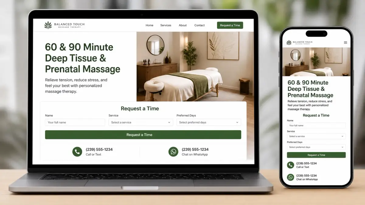
Service summary, request action, and contact details
Service summary. Two or three lines, no menu overwhelm. What you do, who it's for, roughly how it runs. A massage therapist might write: "60 and 90 minute sessions, deep tissue and prenatal, in-studio near the river." Specific beats complete.
Request action. This is the part everyone skips, and it's the whole point. Don't let the page dead-end. Add one block that lets someone request a time, plus a short form for the details you genuinely need to reply: name, service, the days that work. Keep it lean. NNG's research on keeping web forms short is blunt about it: every unnecessary field you cut nudges completion up, so ask for what you need to respond and nothing more. You lock the exact slot yourself afterward.
Contact details. Phone, email, whichever channel you actually check. Some people won't touch a form. They'd rather text. Give them that option and you keep the ones who'd otherwise bounce.
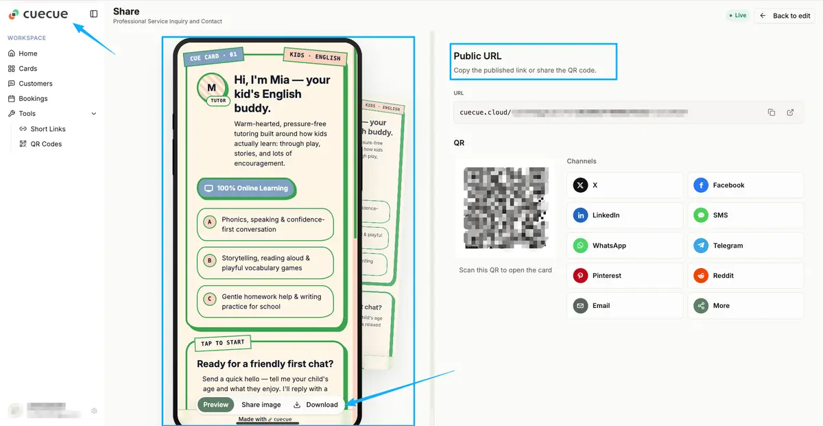
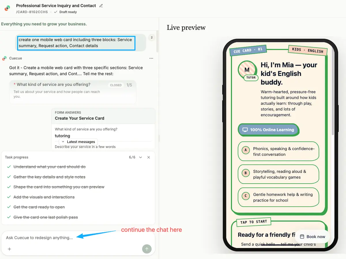
Treat the next part as an example you could build, not a ranking. You could put all three blocks on one mobile web card with a tool like CueCue: a service summary, a "request a time" block, an inquiry form, and your contact links, all sharing a single URL. The tool is interchangeable. The structure is the part that does the work.
Where to share the booking page
A page nobody opens can't book anyone. Once it's live, the real job is dropping the link where ready clients already hang out.
Your Google Business Profile is the heavy hitter for local services. When someone searches your salon or finds you on Maps, you can add a booking link to your profile so they go from search straight to a request without ever hunting down your site. The available options depend on your business category, so check the current steps before assuming the button is there for you.
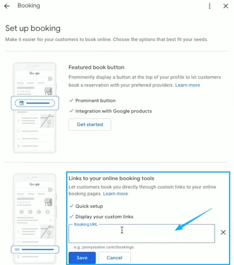
Instagram is the other obvious spot. Drop the link in your bio, since Instagram lets you add a website to your profile right in the edit screen, then point your stories and posts back at it.
Then there's the offline world. A QR code on your business card, your window, your receipt. Someone scans. Your page opens. They request a time without typing your handle wrong or losing the scrap of paper.
When booking pages need more tools
A booking request page has a ceiling, and it's only fair to name it. This kind of page collects the ask. You reply. That's the loop.
It works beautifully when you confirm by hand and your volume stays sane. It stops working the day you need live availability, a synced calendar, automatic reminders, or a deposit taken at the moment of booking, and that is squarely dedicated scheduling software territory. No shame in graduating to it once the manual replies start eating your evenings.
For a lot of solo and small local services, though, the request-and-confirm rhythm holds up for a long, long time. Start with the page. Add the heavier machinery later, when the page itself tells you you've outgrown it.
Booking page example checklist
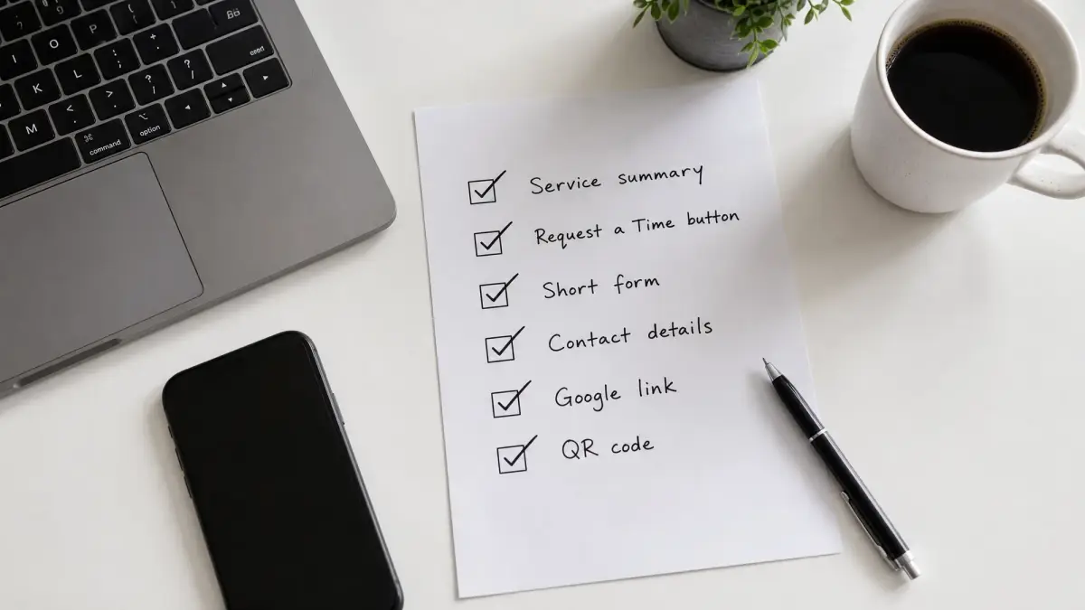
Run your page past this before you share it.
- A service summary in three lines or fewer, specific to what you actually offer
- One request action with a button that names the outcome, never "Submit"
- A short form asking only for what you need to reply
- Contact details for the people who'd rather text or call
- The link added to your Google Business Profile and social bios
- A QR code somewhere physical
If a stranger could land on it and request a time in under a minute, your page is doing its job.
You don't need a bigger website to plug a booking leak. You need the one page that turns a ready message into a booked time. So go build the booking page example above today, link and all, and let it catch the clients you're already earning.
FAQ
What is a booking page?
Think of it as the page a ready client lands on to ask for a time, what some folks call an appointment page. You lay out the service in a line or two. Then one clear way to request a time. Contact stays obvious. Not a full website, just the bridge between "I'm interested" and "I'm on the calendar."
How do local service pros share booking pages?
Wherever clients already look. Usually that's a booking link on your Google Business Profile, the URL sitting in your Instagram bio, and a QR code on anything physical you hand out. Platform options shift over time, so the official help docs are the real source of truth for what each one currently allows.
When do you need full scheduling software?
Once confirming by hand stops scaling. If you're juggling live availability across staff, syncing calendars, firing off automated reminders, or taking deposits at booking, a dedicated scheduling tool earns its keep. Below that line, a simple request page usually does fine.
When is a booking request page enough?
Honestly, most of the time, as long as you're solo or small and you confirm slots yourself. You reply, you lock the time, you move on with your day. If your inbox isn't drowning, the lightweight page is exactly the right amount of tool, no more.
About this content
- Written by
- Mia Anderson, UGC Creator · Content Creator
- Reviewed by
- CueCue Team, Editorial review desk
- Last updated
- June 24, 2026
- Editorial standard
- CueCue articles are written for practical use, checked for clear sourcing, and updated when product or policy details change.