The third time I retyped my rate sheet into a fresh PDF, I sent a brand the wrong one. Old prices, a service I'd stopped offering, a typo sitting in my own name. They caught it before I did.
For a long stretch my "offer" lived in whatever doc I'd opened last. Every small drop or mini-service I launched got the same scramble: dig up the details, paste them somewhere, hope it looked legit enough to charge for. What fixed it wasn't a slicker PDF. It was one small page I could point everyone to. So this is a tour of product landing page examples for small offers, the structure behind the ones that actually work, and how to copy the bones without copying anyone's homework. No full website needed.
Short version: a strong small-offer page does three things fast. It says what the thing is, shows one believable reason to trust it, and gives one clear action. Everything below is a variation on that. If you only build one this week, build the one for the offer you're actually pushing.
What strong product landing page examples have in common
I've clicked through a lot of small-offer pages. Creator drops, coaching packages, one-product stores, a friend's zine pre-order. The good ones don't share a look. They share a spine.
The top of the page answers the only question a cold visitor has: what is this, and is it for me? Not a clever headline. A plain one. Then comes a single proof element, a photo of the actual thing, one real testimonial, a sample you can click, a number you can stand behind. Then the action, sitting right where the thumb already rests.
That's the whole skeleton. Baymard's ongoing usability research keeps finding that a large share of product pages, especially on phones, leave shoppers guessing about basic questions like what they're even buying and why (Baymard's product page UX findings). The small pages that convert aren't fancier than the ones that don't. They just answer faster.
So before you copy any layout, name the one question your visitor is silently asking. Then treat the entire page as your answer to it.
Small offer page patterns
Not every offer wants the same page. These are the three shapes I keep reaching for, and how I decide between them.
Product card, drop page, and service package
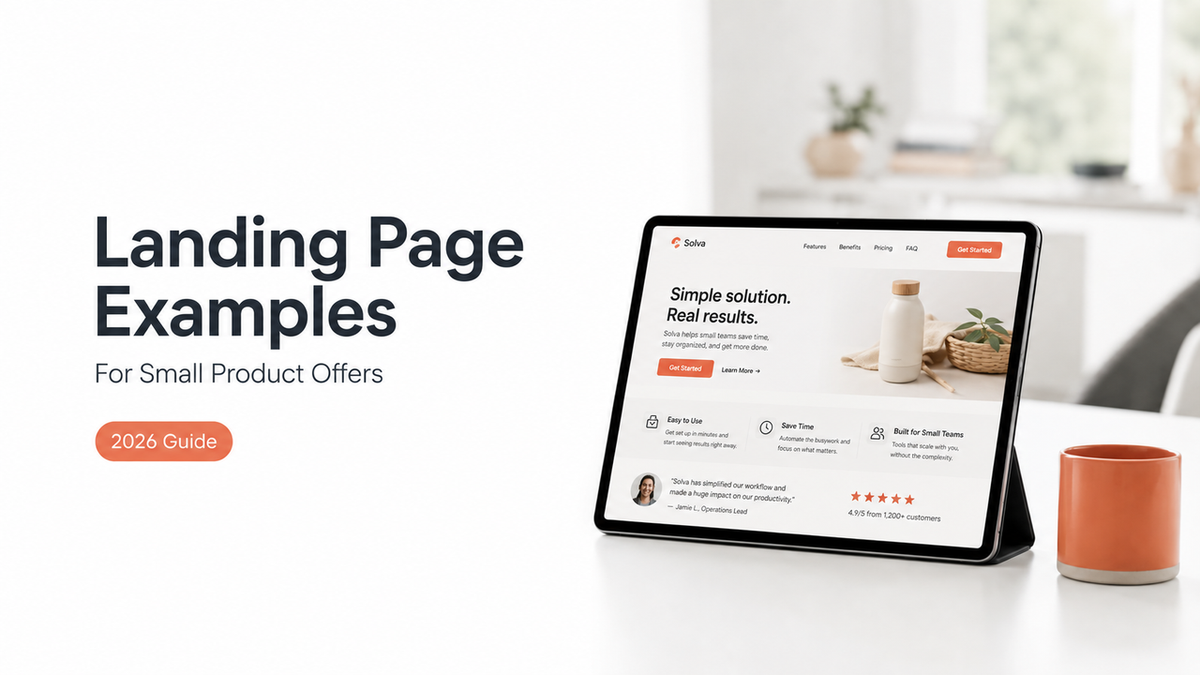
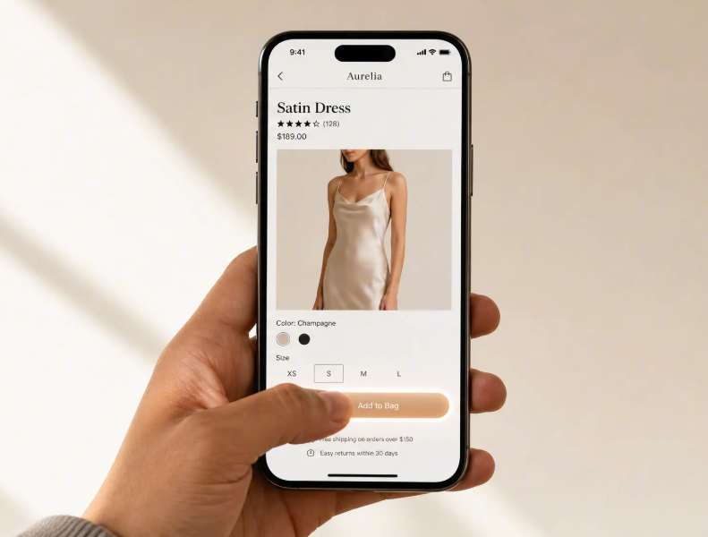
A product card is the lightest of the three. One thing, one image, one price, one button. I reach for it when there's nothing to explain. A single digital download, a print, a small physical item where the photo carries the pitch. Keep it short enough that nobody has to scroll past the fold to find the buy action.
A drop page is a product launch page when your launch has a date attached. It adds urgency without inventing it: what's dropping, when, and how to be there when it does. If there's a real limit, fifty copies, a Friday cutoff, say it once and plainly. A drop page lives or dies on its first screen, because most people land from a story or a bio link and decide in a couple of seconds whether to care.
A service package, sometimes just an offer page, carries the most weight. What's included, who it's for, and what happens after someone clicks. This is the exact spot where I used to fail by firing off PDFs. A single page that lists the package, one honest proof point, and a "book a call" or short inquiry form did what five scattered DMs never managed.
Match the shape to the action you genuinely need, then build only that one. A drop page pretending to be a full catalog just confuses the person you finally got to show up.
Mobile-first sections to include
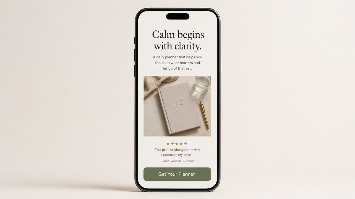
Almost everyone opening your link is on a phone, mid-scroll, half-distracted, maybe in line for coffee. The page has to work thumb-first or it doesn't work.
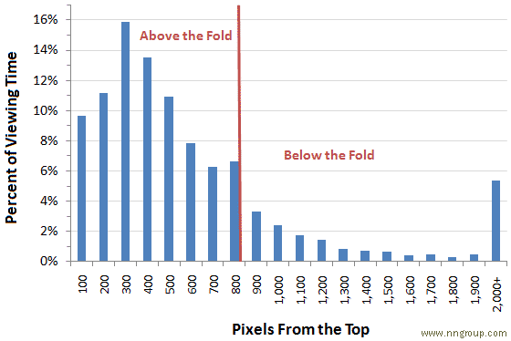
Nielsen Norman Group's eye-tracking research shows attention bunches up near the top of a page and thins out quickly as people scroll down (NN/G on scrolling and attention). On a mobile landing page, that makes your first screen the whole ballgame: the name of the thing, one proof element, and the action, all reachable without hunting.
Below that, ranked loosely by how much each piece pulls its weight: a couple of real images or a short clip, then the plain-language details, then one trust signal you didn't fake, and finally a second copy of the button so nobody has to scroll back up to buy. Shopify's own product-page guidance points the same direction. It puts CTA visibility, clear imagery, and mobile usability above anything decorative (Shopify on product page optimization).
The lesson I learned the slow way: never bury the action under a wall of description. If your own thumb can't find the button in two seconds, theirs won't either.
What these examples should not promise
This is the part where I get a little protective of you. A small-offer page is a sales pitch, and a pitch is easy to overcook.
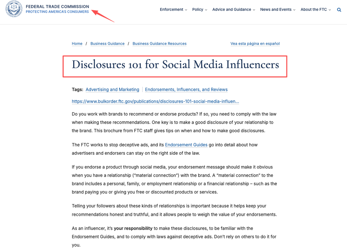
Don't promise outcomes you can't back up. "Double your income," "guaranteed results," "clinically proven," if you can't prove it, it isn't a selling point. Promoting something for a brand, or got it free? Then it has to show on the page, out where people actually look, not buried three scrolls down. The FTC put out a plain-English disclosure guide for creators that covers the whole thing. Give it ten minutes before you publish (FTC disclosures for influencers).
A page doesn't need hype to pull its weight. It needs to be clear, honest, easy to act on, and that's it. The product landing page examples that still hold up a year later? They're the ones that never promised more than the thing actually delivers. Write the page you'd trust if some stranger dropped it in your DMs.
How to adapt examples into your own page
You've seen what the strongest product landing page examples have in common. Copying the bones instead of the words is the whole trick. This is how I'd do it in one sitting.
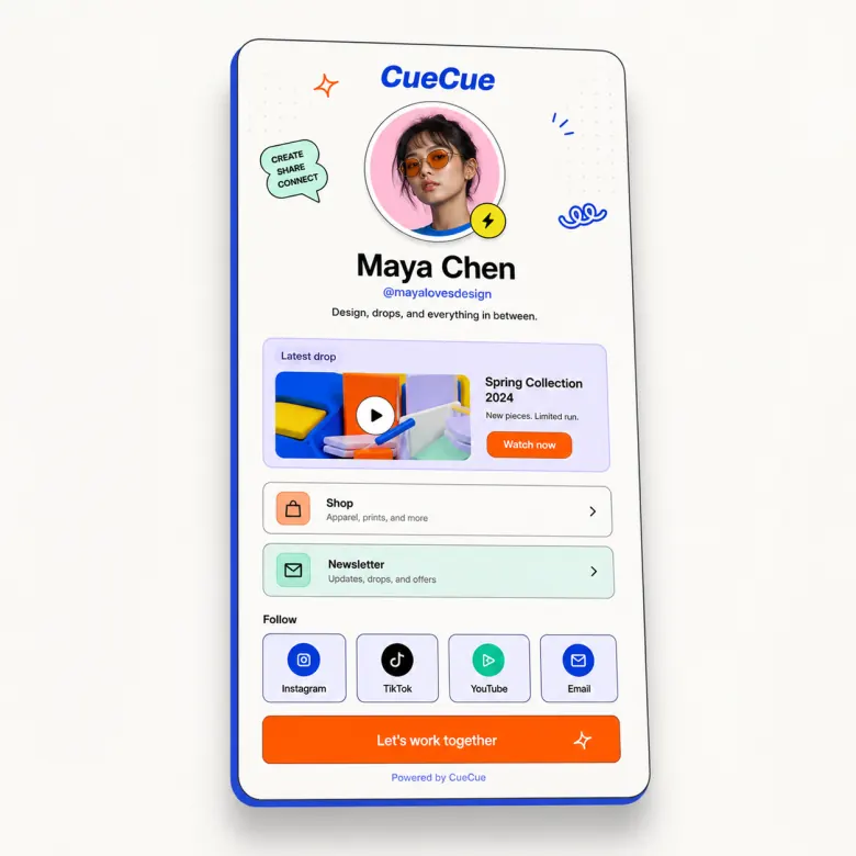
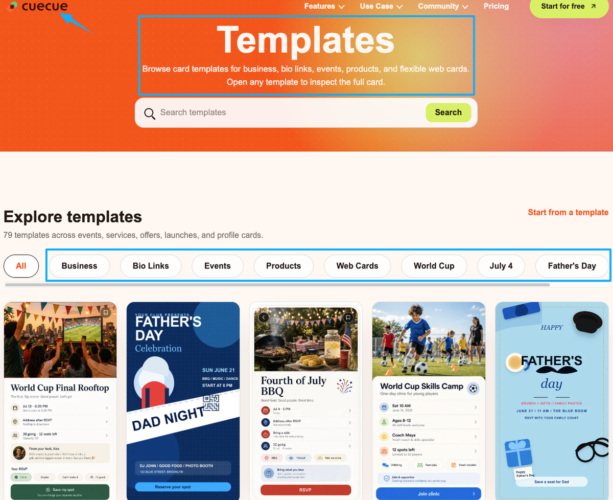
Start from a template, not a blank page. Pick a product card or offer layout where the structure is already correct, so all you're doing is swapping words and images. (CueCue's product landing page is one example you could start from, and there's a wider template gallery to riff on.) Drop in your one plain headline. Add your single strongest proof element. Write the details like you're texting a friend who just asked what you're selling. Put the button where the thumb already sits, then repeat it once near the bottom.
Then do the step almost everyone skips. Open the page on your own phone, pretend you've never seen it, and try to complete the one action in under ten seconds. Anything that slows you down, cut it. That awkward ten-second test catches more problems than any redesign.
You already did the hard part. You made something worth selling and got people to look at it. Don't let a clumsy page be the reason all that attention quietly drains away. Open one template, build the page for the offer you're pushing this week, and share the link. You've got more of a knack for this than you're giving yourself credit for.
FAQ
What is a product landing page?
One focused page built around a single offer and a single action, whether that's buy this, book this, or sign up. A full site scatters people across menus and a dozen paths; this kind of page aims them at exactly one next step, which is why it fits small drops and solo services so well.
How do you structure a small product page?
Work top to bottom. A plain headline saying what the thing is, then one believable proof element, then the details, then a clear button you repeat once further down. The catch is making that first screen self-sufficient, so someone on a phone can act without scrolling around hunting for the point.
When should a product use a one-page offer page?
Whenever the goal is a single action and a whole website would be overkill. Think a solo drop, one limited service, or a launch you're pushing from social. One page keeps the visitor aimed at the one thing you actually need them to do, instead of wandering off into a navigation menu.
What should a product landing page avoid?
Three things, mostly: claims you can't prove, brand relationships you've hidden, and a call to action nobody can find. For anything touching prices, platform policy, or disclosure rules, follow the current official documentation rather than a blog post, including this one.
About this content
- Written by
- Mia Anderson, UGC Creator · Content Creator
- Reviewed by
- CueCue Team, Editorial review desk
- Last updated
- June 13, 2026
- Editorial standard
- CueCue articles are written for practical use, checked for clear sourcing, and updated when product or policy details change.