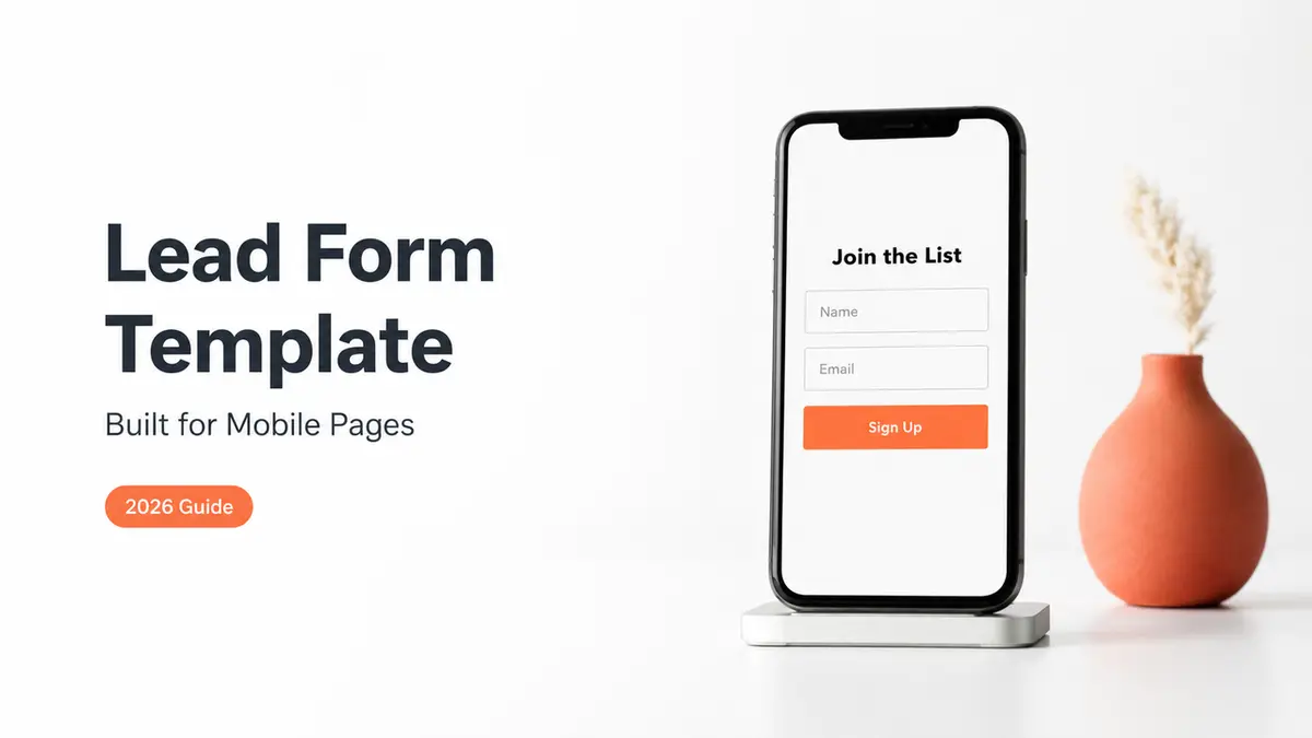
Mia here. I once saved eleven "lead form templates" to a folder and built none of them. The one form I did make, for a tiny workshop, asked so much that filling it out felt like doing my taxes. Two people finished it. Everyone else opened it on their phone, saw a wall of fields, and left.
So this is the guide I wish I'd had back then. How to pick fields by what you actually need. Where to put the form so a person on a phone finishes it. No theory, just the version that gets replies.
What a lead form template should do
A form's job isn't to collect everything you might one day want. It's to get you one reply you can act on.
Sounds obvious. It isn't, because every empty field quietly whispers "ask for this too." Resist that. Research on form usability keeps landing on the same uncomfortable point: every field you remove tends to lift the share of people who finish, which is why shorter forms quietly out-collect longer ones even when they ask for less. The shorter the ask, the more replies you actually get to work with. You can read the usability research on form fields if you want the reasoning in full.
So a good template does a few small jobs and stops. It tells the person what happens after they hit send. It asks only for what your very next step needs. It fits a thumb on a small screen, no pinching, no sideways scroll.
If your current contact form does more than that, it's working against you. Cut, don't add.
Choose fields by use case
Here's where most templates go wrong. They hand you a generic contact form and call it finished. But a creator chasing brand collabs and a plumber taking job requests do not need the same fields at all. Match the form to the job in front of you.
Creator inquiry, service request, and event follow-up
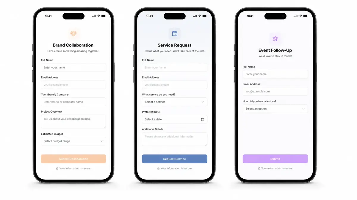
Creator inquiry (brand collabs, UGC, partnerships). You want enough to quote without forty back-and-forth DMs. Three or four fields does it. Name or brand, budget range, timeline, the platform or deliverable. Skip the giant "tell me about your project" box. People won't fill it, and you'll end up asking follow-ups anyway.
Service request (local business, freelancer). Now you need just enough to say yes, no, or "let's talk." Name, contact, service needed, a rough date or location. A real estate agent wants the neighborhood. A photographer wants the shoot type. It's one inquiry form with the fields swapped for your trade, and that's pretty much the whole trick.
Event follow-up. Someone showed up or RSVP'd and you want to stay in touch. Keep it tiny. Name, email, one checkbox for "tell me about the next one." A lead capture page that runs after an event lives or dies on being a five-second ask instead of a survey.
See the pattern? Fewer fields, chosen on purpose. Write down the one next action your form is for, then add only the fields that action genuinely needs. Delete the rest before you ever publish it.
Place the form inside an action page
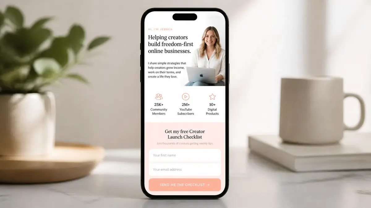
A form on its own is a dead end. Nobody searches for your contact form. They land on it after a tap from somewhere else, which means the form needs a home: a single mobile page that says who you are, shows a proof point or two, and puts the form right there in front of them.
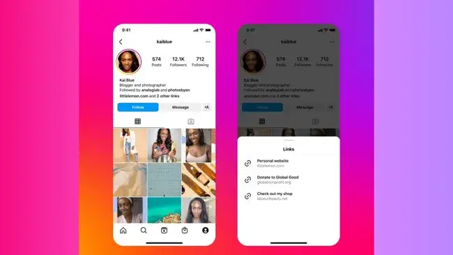
This matters because of how people actually reach you. You get one link in your Instagram bio, and even after Instagram added more bio links, most people still tap through one main link. One QR code on a flyer or a laptop lid. One "link below" in a caption. All of that traffic should hit a page where the inquiry form is the obvious next move, not buried three taps deep behind a menu.
Treat the page as the frame and the form as the point. Photo. A line about what you do. Maybe a rate or two. Then the form. On a mobile form, that order keeps a stranger moving toward "send" instead of drifting back to the app they came from.
You can build all of this with a full website. You really don't have to. A focused page tool gets you there in an afternoon, and the form sits inside the page instead of stranded on its own lonely URL.
Lead form mistakes to avoid
I've made every one of these. Most of them more than once.
Too many fields or unclear follow-up
Too many fields. This is the big one. Every extra question is one more reason to quit halfway. If you don't need an answer to take your next step, don't ask for it on the form. You can always ask later, inside the reply.
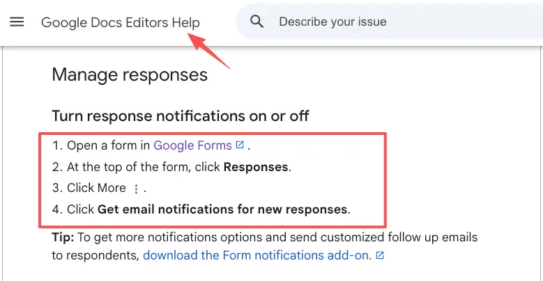
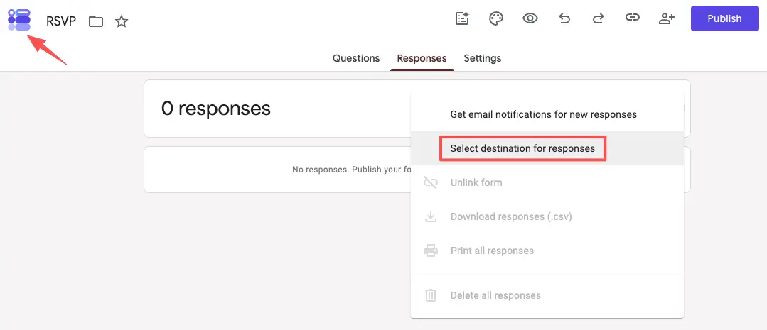
No clear "what happens next." A bare form with a "Submit" button leaves people unsure anyone's even home. Add a single line near the button: "I reply within a couple of days." Then set it so you genuinely get pinged when someone fills it in. Google Forms can email you on every new response, for instance, so an inquiry never sits unseen for a week.
Sensitive stuff you don't actually need. No home address for a quick quote. No phone number when email is plenty. Over-collecting makes people uneasy and quietly tanks your replies. Ask for the minimum, and say why you need each thing when it isn't obvious.
A form that fights the thumb. Tiny tap targets. A dropdown with fifty options. A "clear" button sitting right next to submit. Open it on your own phone before you share it anywhere. If you fumble your way through, so will every person you were hoping to hear from.
Lightweight lead form template checklist
Run your form past this before it goes live. Takes about two minutes.
- One next action, named. You know exactly what a finished form lets you do.
- Three to five fields, tops, unless you have a real reason for one more.
- Labels sitting above each field, not hidden as gray placeholder text that disappears the second someone types.
- A visible "what happens next" line near the button.
- Notifications switched on, so a new inquiry reaches you fast.
- A way to get your leads back out. Pick a tool that lets you export responses to a spreadsheet so your contacts stay yours to keep.
- Opened and finished on your own phone once, start to end.
All seven true? Share it. Not yet? You just found your fix.
Your one move
You don't need a bigger form. You need the small one that turns a tap into a reply. Build the three-field version for your single use case, drop it on a page people can reach from your bio or a QR code, and let it do the catching while you sleep. Here's an example you could build: a tool like CueCue lets you put a short inquiry form right inside one shareable card, so the form and the page are the same thing. Turn every share into an action, starting with the next person trying to reach you.
FAQ
What is a lead form template?
A reusable starting point for the form that catches inquiries. The fields, the order, the "what happens next" line, already set up to drop into a page. Instead of staring at a blank builder, you copy a layout that already fits a use case, like creator inquiry or service request, and change the words to yours.
How do you add a lead form to a mobile page?
Quickest route: build the form inside the page itself, so people answer without ever leaving. If your page tool doesn't do forms on its own, you embed or link one instead. Whichever way, the form has to be reachable from the single link you actually share, whether that's your bio, a QR code, or a caption.
When should a lead form be short?
Almost always. Shorter forms get finished more often, and cutting fields tends to raise the number of completed inquiries you receive. Keep it longer only when a bigger ask genuinely screens leads better and you'd rather field fewer, more serious replies. That's a deliberate trade, not a starting point.
What should a lead form avoid collecting?
Anything you don't need for the next step, plus anything sensitive you can't clearly justify asking for. Rules around sensitive data and disclosure shift over time, so for what you're allowed to collect and how you have to handle it, check the official documentation of whatever platform you build on rather than guessing.
About this content
- Written by
- Mia Anderson, UGC Creator · Content Creator
- Reviewed by
- CueCue Team, Editorial review desk
- Last updated
- June 17, 2026
- Editorial standard
- CueCue articles are written for practical use, checked for clear sourcing, and updated when product or policy details change.