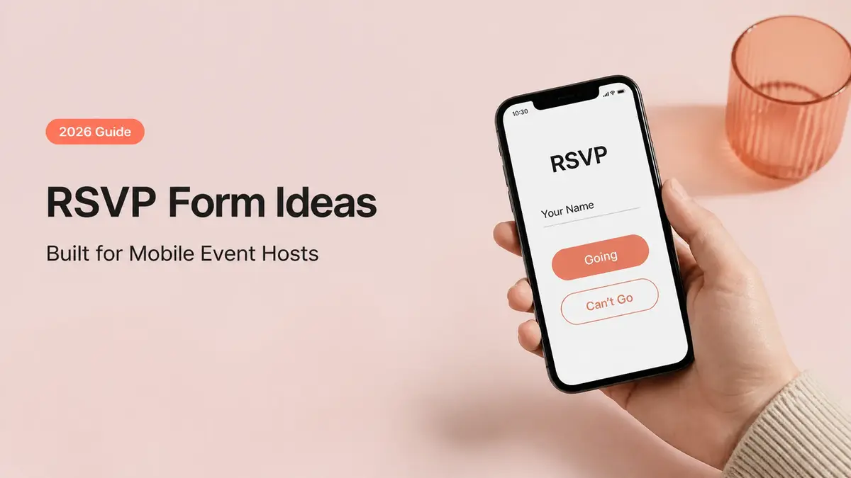
"Just let me know if you're coming." That line was sitting in three different spots before a backyard workshop last fall. My Stories. A group chat. The event caption itself. By Thursday the replies were scattered everywhere. Two yeses sitting in DMs, one "maybe!" buried under a Story reply, a text from someone who'd already told me in person at coffee. I counted heads four times. Still got it wrong.
That scramble is the exact thing an event RSVP form is meant to kill off, and most of them just don't, because they ask for the wrong stuff and leave you doing arithmetic in your notes app. So this is about the few fields that actually nudge a guest toward showing up. The flow that carries them there. And the moment a plain mobile page beats a form outright.
What an event RSVP form should collect
The question isn't "what could I ask." It's narrower than that. What do you, the host, actually need to know to do the next thing on your list? Order the right amount of food, send the address, cap the room, plan the seating. Every field on the form should map to one of those host actions. If a field doesn't change something you'll do, it's just friction sitting between a willing guest and a "yes."
Only fields needed for the next host action
Here's the short version I land on for most small events. Name. A clear yes, no, or maybe. Headcount, if plus-ones are allowed. One way to reach them if plans change. And at most one event-specific field, like a dietary note or a song request, only when it genuinely changes your prep.
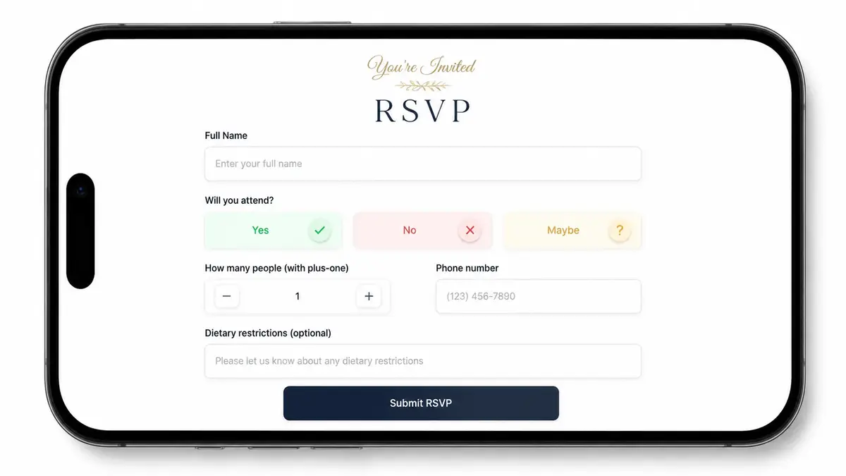
That's it. No mailing address for a backyard hangout. No "how did you hear about us" for twelve friends. The longer the form, the more people open it, sigh, and decide to "do it later." Later rarely comes.
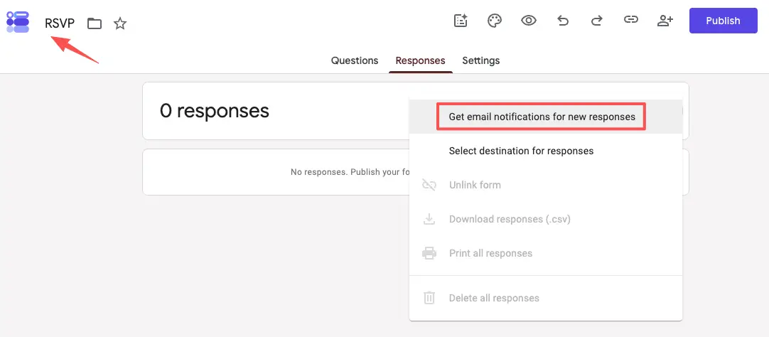
Set one thing up before you share anything: make sure you can actually pull the list out. Collect through a Google Form, and you can route responses to a linked Sheet, so your guest list ends up somewhere you can sort it, count it, and reuse it next time. A pile of replies you can't export is a headache you signed up for on purpose.
Design the RSVP flow around the guest
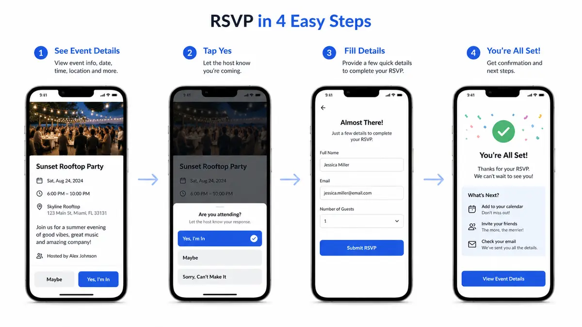
Guests decide in a few seconds, usually with a thumb, usually mid-scroll. So the order matters. Lead with what they need to decide: date, time, place. Then the ask. Then a tiny line about what happens after they tap "yes," so the page doesn't feel like a void.
Think about the cold guest. Someone who saw your Story, doesn't have the context your group chat has, and just wants to know if this is worth their Saturday. If your form opens with five questions before it tells them when and where, you've lost them. Put the why and the when up top. Make the reply itself almost effortless. The whole thing should fit one screen, with one obvious action, and no login wall if you can avoid it. Every extra tap is a place where a maybe quietly turns into a no.
RSVP form ideas by event type
The "right" form changes with the event. Same core fields, different one detail that matters.
Meetup, workshop, private gathering, and local event
A casual meetup barely needs a form at all. Name, yes or no, and a way to send the location once it's confirmed. Keep it light. The point is a headcount, not a registration desk.
A workshop earns one more field, because you're prepping something. Could be a skill level. Could be a tool to bring, or one question they're hoping you'll get to. That single line lets you build the session around them. And it tells the guest, without you spelling it out, that you care how the thing actually goes for them.
A private gathering, like a dinner or a baby shower, leans on plus-ones and dietary notes. Those two fields do real work here. They decide how much you cook and how many chairs you drag in from the garage.
Hosting a pop-up or a local launch? Your absolute top priority is getting a reliable contact method. You need a way to shoot over a 24-hour reminder or a quick "yes, we're still happening" text when it starts pouring. Honestly, grabbing a standard RSVP form template or a basic small event RSVP page that you can just duplicate and adjust is the smartest move. It stops you from reinventing the wheel every single week.
Common event RSVP form problems
Most forms collect fine. The leak is everything around the form.
The first problem is the one I opened with: replies land in five different places and there's no single list. A form fixes that only if you point everyone to it instead of also saying "or just DM me." Pick one channel. Mean it.
The second is silence on your end. You set up a form, share it, then forget to check it for two days and miss three early yeses. If you're using Google Forms, turn on email notifications for new responses so a reply actually reaches you instead of waiting in a tab. Small setting, big difference.
The third is over-asking, which I already beat up on, but it's worth repeating because it's the most common. Each field you add is a small tax on completion.
The fourth is the dead end: a form that says "thanks!" and nothing else. Tell people what's next. When they'll hear from you, where to add the date, what to bring. A confirmation that does nothing is a missed chance to make the "yes" stick.
When to use a mobile RSVP page
A form collects answers. A page does that and also explains the event and gives people a reason to say yes in the first place. That's the line between a Google Form and a real mobile event page.
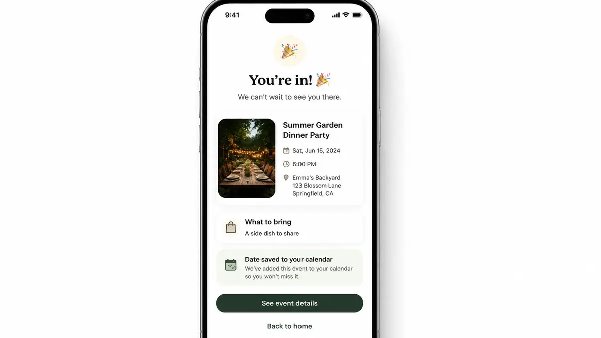
I learned this the lazy way. A pop-up I co-hosted needed an RSVP, and I built the whole thing on my phone in a coffee shop in about ten minutes, right before I posted the Stories. Event photo up top. Three lines: what, when, where. One RSVP button. A "save the date" link under it. Cold guests landed, understood it in a glance, and replied without leaving the page. No tax form energy, no five-tab scavenger hunt.
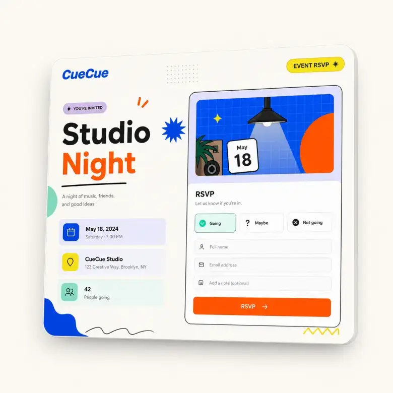
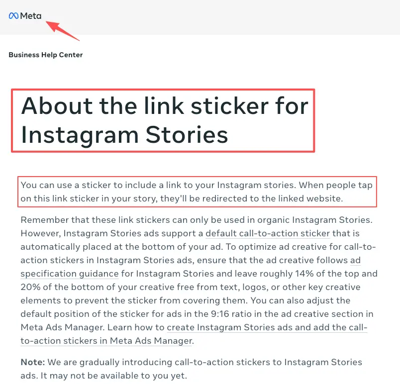
Here's an example you could build: a single mobile event page (a tool like CueCue is one way to do it) with the photo, the details, the RSVP, and a follow-up link all on one screen, then dropped into your Stories with the Instagram Stories link sticker. Guests come, see, respond, and get their next step in one place. That's the difference a page buys you over a bare form.
When does the heavier stuff make sense? Selling tickets, handling refunds, juggling real capacity logistics? Use a full event registration platform built for that. If you're just putting together a local meetup, a dinner party, or a quick workshop, heavy registration software is total overkill. A clean, lightweight mobile page featuring a single RSVP link gets the job done perfectly while keeping things looking sharp and intentional.
Here's your quick win for today. Grab an RSVP template, plug in your core details—the date, the location, and that single custom field you actually need—and get the link ready before your next batch of Stories goes live. It takes maybe ten minutes. In return, you finally get a clean, single source of truth for your entire guest list. No full website needed. Future-you, counting heads exactly once, will be glad you did.
FAQ
What is an event RSVP form?
It's the small form guests use to tell you whether they're coming, plus the few details you need to host them well. Think names, a yes or no, and maybe a headcount. The good ones stay short and lead straight to one clear reply.
How do hosts collect RSVPs online?
Most people start with a simple form or one mobile page, then drop the link wherever guests already hang out. A bio. A Story. A group chat. A QR code on a flyer. Whatever you pick, funnel everyone to the same spot. Scattered replies are the exact thing you're trying to dodge, so don't crack the gap back open by adding "or just message me."
When is a mobile RSVP page better than a form?
Whenever the event needs selling, not just counting. A bare form works when guests already know they're in. A page wins when someone cold needs the what, the when, and a reason, all before they'll commit. If you're sharing to people who haven't heard the pitch yet, lean page.
What should an event RSVP form avoid asking?
Anything that doesn't change a decision you'll make. Skip the mailing address for a backyard hangout. Drop the long survey. Stop adding fields just because you're used to seeing them. As for the technical side—privacy policies, data handling, and notification routing—always pull that info directly from your software’s official documentation. I don't guess when it comes to user data; I verify. Platform rules update constantly, so go straight to the source.
About this content
- Written by
- Mia Anderson, UGC Creator · Content Creator
- Reviewed by
- CueCue Team, Editorial review desk
- Last updated
- June 17, 2026
- Editorial standard
- CueCue articles are written for practical use, checked for clear sourcing, and updated when product or policy details change.