My old Linktree had seven buttons. YouTube, a podcast, a blog I'd stopped updating, a newsletter I'd quietly killed. Buried in there, a "buy me a coffee" link. People clicked around, left, and that tip link almost never got the tap.
For a while I figured I needed a better support tool. I was solving the wrong thing. The question was never which tool had the prettiest button. It was what I actually wanted a visitor to do the second they landed on my link, and whether a single thing on that page made the next step obvious instead of optional.
That reframe runs through this whole comparison. By the end you'll know which kind of tool fits the one action you care about, instead of swapping platforms and hoping.
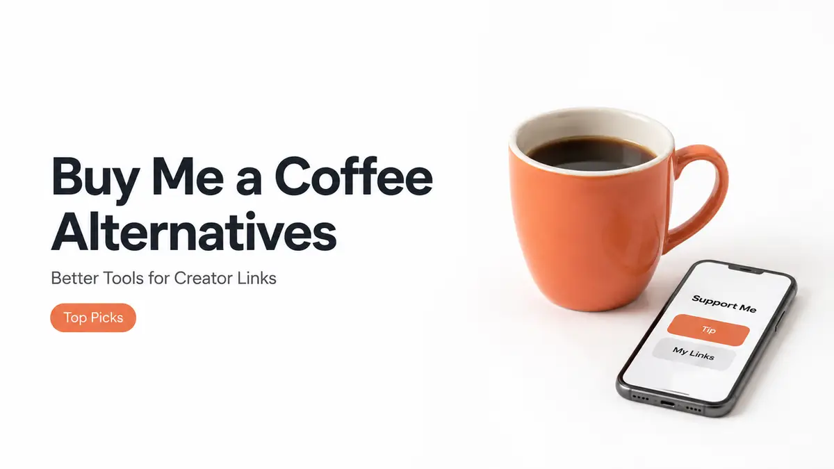
Why creators compare Buy Me a Coffee alternatives
People go looking for alternatives for very different reasons, and naming yours first saves a lot of wasted effort. Some want lower fees. Some want features the tip jar doesn't have. Some just feel like a plain support link isn't pulling its weight. That last one was me. Took me embarrassingly long to own up to it, too. The link wasn't broken. It was just parked at the bottom of a page that threw ten other things at people first, so by the time anyone scrolled down to it, they'd already drifted off somewhere in their head.
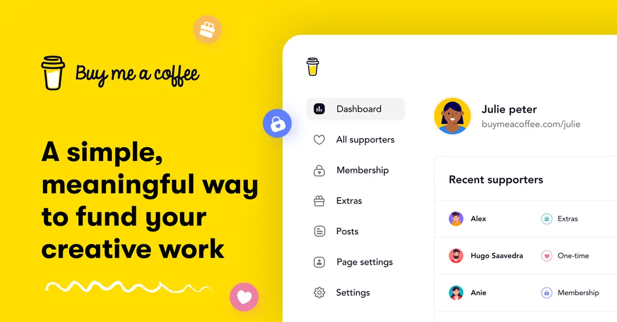
Buy Me a Coffee itself is a clean, friendly support link. A fan can leave a one-time tip without even making an account, and you can bolt on memberships or a shop later if you want. Its own overview of how it works lays that out plainly.
Fees are the loudest reason people bring up, and sure, they matter once real money starts moving. But early on, they're rarely what's actually holding a creator back. The real gap is usually visibility. A support button nobody spots. A link buried so deep that only your most stubborn fans ever dig it out. Sort that first, and the fee math can wait its turn.
So "alternative" can mean three different things. A different support platform. A richer page. Or just a better place to put the link you already have. Figure out which one you mean before you shop, because most "I need to switch" moments are really "I need to rethink the page."
Support link vs creator landing page
This is the split that decides everything. A creator support link does one job well. It points at a single action: support me. A creator landing page does several. Support, sure, but also book, buy, subscribe, watch, follow.
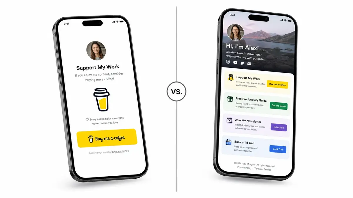
One support action vs multiple audience actions
A support link is built for one move. Tap, tip, done. Behind the scenes, a payment processor like Stripe moves the money from the fan to you. It converts well precisely because it's narrow. There's nothing else to think about.
A creator landing page widens the ask on purpose. It can hold your bio link, an offer page, an email sign-up, and a support button, all in one spot. That's more reach, but also more room for a visitor to wander off without doing anything.
There's a real cost to every extra option you put in front of someone. The more choices you offer, the longer people hesitate, and hesitation at the exact moment you wanted action is how a warm visitor quietly becomes a closed tab. A focused support link sidesteps all of that, which is its understated superpower.
Both shapes are legitimate. They just answer different questions, and the mistake I kept making was treating a tooling problem like a platform problem, when what I actually needed was to step back and decide what one visit was supposed to accomplish.
Neither one is the winner. A support link wins when a tip is the only thing you want. The page earns its keep the moment support is just one of several jobs you need done. So before you compare a single tool, decide whether your visitor has one job or several.
When a creator page is useful
A page makes sense when you're carrying more than one ask. You're selling a small offer, taking the odd booking, collecting emails, and accepting support, all at once. A single page that sends people to the right action beats five links scattered across your bio.
It also helps when the ask needs context. Who you are, what you make, why support keeps it going, sitting right above the button. A bare link skips all of that. A page can warm someone up first.
It pays off for seasonal pushes too. A holiday drop. A launch week. A fundraiser with a deadline ticking. Each one gets a lot easier to share when a single page holds the story, the offer, and the support button in one spot, instead of bouncing people across three tabs to hunt down the part they actually came for.
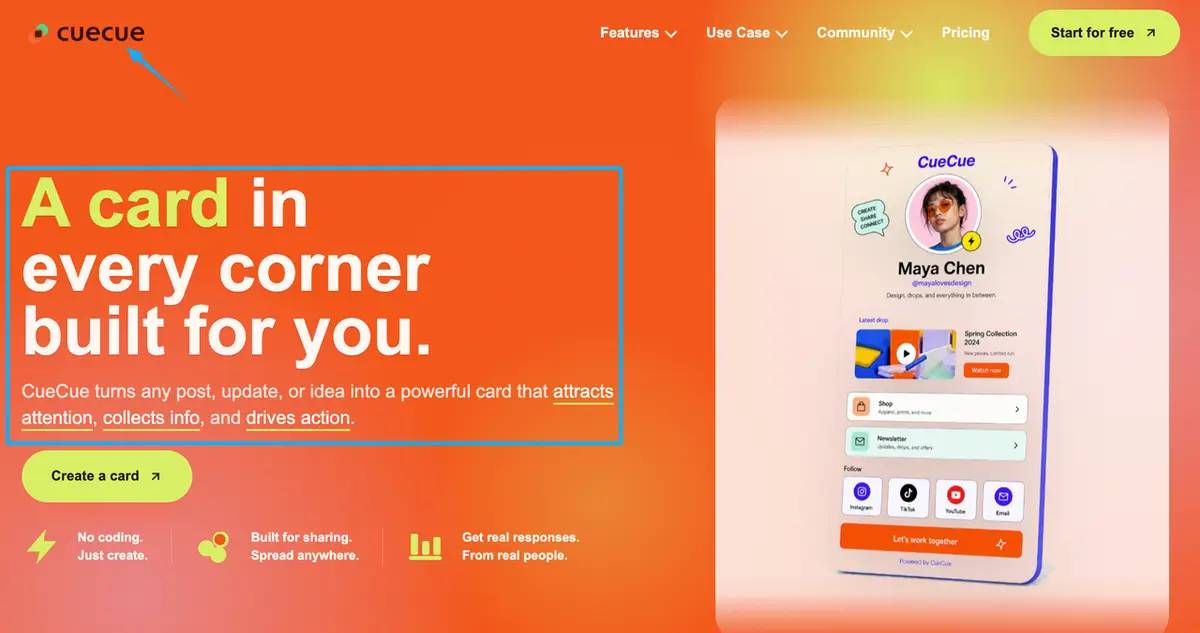
And it fits when you're sending campaign or ad traffic somewhere and need one focused destination instead of a homepage. Here's an example you could build: a single action page, made with a tool like CueCue, that holds your support link next to your offer page and your sign-up, so one share covers everything you want people to do. The support button is there. It's just not the only door.
When a support platform is better
Sometimes the page is overkill and a dedicated support platform is exactly right.
Go with a support platform when what you want is one clean, low-pressure ask and nothing more. That "buy me a coffee" gesture lands as a thank-you, not a sales pitch, and the friendliness is the entire point. So don't water it down.
It's also the right pick when you're early. If you don't have an offer page, a booking link, or an email list yet, a whole landing page is just a building full of empty rooms. Start with the one ask you actually have. Add the page later, once there's genuinely more for it to hold.
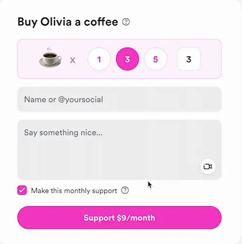
It also fits when you want recurring support without running a full membership. Buy Me a Coffee's Monthly Support option, for example, lets fans chip in every month without you owing them perks or exclusive posts. That's a different decision from building out membership tiers, which is a bigger commitment worth its own look.
And it fits when you'd rather the platform handle payouts, receipts, and your supporter list for you. Ko-fi runs that whole support flow and pays out through your own PayPal or Stripe account, for instance. Just remember every platform sets its own rules on fees, payouts, and what you're allowed to collect. Read the current terms before you commit to one.
Choose a Buy Me a Coffee alternative by audience action
Skip the feature spreadsheets. Pick by the one thing you want a visitor to do.
Want one-time tips and nothing else? A clean support platform is plenty. No page needed.
Want recurring support, but no perks to manage? Pick a platform with a monthly-support option, and leave memberships for when you actually want to run them.
Want support plus other actions, like an offer page, bookings, or a sign-up? Use a creator landing page that holds the support link alongside the rest, so people can do any of it from one tap.
Just need somewhere to put the link you already have? Keep your support platform. Give it a real home instead of a buried URL, and point your bio link at a page people can actually act on.
Still can't tell which bucket you're in? Then default to the simplest tool that handles the one ask you've got today. Let it grow into the rest later, when you actually add those asks, and not a minute sooner.
Pick your one action
Your move today is small. Write down the one thing you want a visitor to do. A tip, a subscribe, a booking, a buy, whatever it is. Then pick the tool that makes that single thing dead simple to pull off. Only a tip? A clean support platform is plenty. That plus a few others? Put the support link on one page that handles the rest, and send your bio link there. Turn every share into an action, and make the action you picked the obvious one.
FAQ
What is a Buy Me a Coffee alternative?
Any tool a creator uses instead of, or alongside, Buy Me a Coffee to collect support. That might be another support platform like Ko-fi, or a creator landing page that holds a support link next to your other actions. Which one fits comes down to whether you want only tips or several actions in one place.
How do creators share support links from a bio page?
Point one link in your social bio at a single page, then put the support action right where people land. Most creators send their Instagram or TikTok bio to one URL and let that page carry the "support me" button along with everything else. The link is the door. The page is the room.
When is a creator landing page better than a support link?
When support isn't the only thing on your list. If you're also pushing an offer page, taking bookings, or capturing emails, a page that routes people the right way beats a lone tip link. A bare support link only wins when a tip is genuinely the single action you care about.
What platform rules should creators check?
Fees, payout methods, which countries are supported, and what you're allowed to sell or collect. These differ from platform to platform and change over time, so read the current official documentation for whichever tool you pick rather than trusting a comparison post like this one. Cross-border payouts and tax handling especially tend to vary by country, so confirm the specifics for where you and your supporters are based before you lean on any single platform.
About this content
- Written by
- Mia Anderson, UGC Creator · Content Creator
- Reviewed by
- CueCue Team, Editorial review desk
- Last updated
- June 22, 2026
- Editorial standard
- CueCue articles are written for practical use, checked for clear sourcing, and updated when product or policy details change.