When did someone who watched one of your faceless videos last do something other than scroll on — not tap like, but actually click through and reach out? I asked myself that after a week of MoneyPrinterTurbo clips that pulled views and went nowhere.
The captions were clean. Too clean, honestly. I'd let AI draft them and they read like every other video in the feed, so I started dropping one real line back in just to get a single comment. Views kept coming. Action didn't. If you make faceless video and feel that same gap, this is about the part that actually closes it: not your next MoneyPrinterTurbo upload, but where that upload sends people. By the end you'll know what to build so the traffic has somewhere to land.
Short version: MoneyPrinterTurbo makes the videos fast. It doesn't make a place for viewers to act. Send them to one simple page built around a single next step, like a link in bio or a creator landing page, instead of a profile full of dead ends.
Why MoneyPrinterTurbo traffic needs a second step
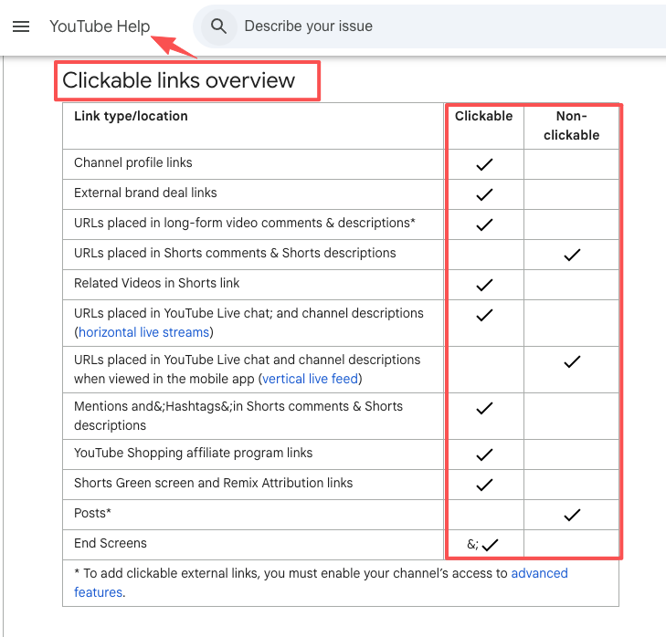
Once your MoneyPrinterTurbo channel starts moving, you run into something the platforms would rather you didn't notice: they're built to keep people watching, not to hand them off to you. On YouTube, the links you drop into Shorts descriptions and comments aren't even clickable. The platform makes them plain text on purpose, and the only links that travel are the handful on your channel profile, as YouTube's own link-sharing rules spell out. So a viewer who wants more from you hits a wall, taps your profile, and finds... what?
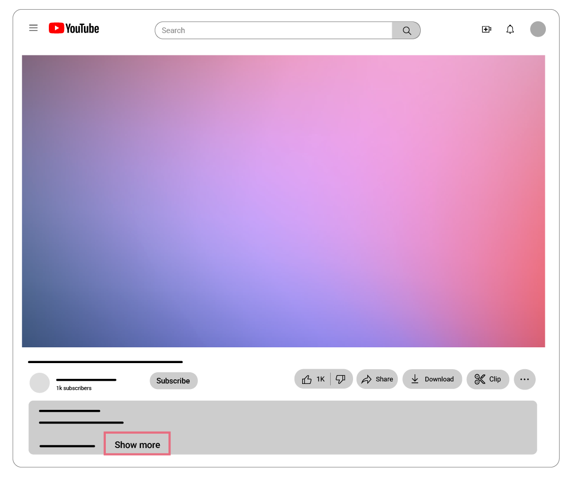
For most faceless video creators, the answer is a row of icons and a half-finished "about" section. That's the missing second step. The video already did its job — it earned attention. But attention that can't act just leaks back into the feed. The fix isn't more MoneyPrinterTurbo output. It's giving every view one obvious place to go and one obvious thing to do when it gets there. Decide that destination before you upload again.
What faceless video creators should send viewers to
So where should the click actually land? Not on another platform profile, and not across five different tabs. One page. The only real question is what that page is for.
Link in bio, creator landing page, offer, newsletter, and lead form
Think of it as a menu with one daily special. A link in bio page works when you want a viewer to pick from a few clear paths: watch more, follow elsewhere, grab the free thing. A creator landing page narrows it further to one offer, one story, one button. If you're funneling people toward a single product or service, that focus tends to convert better than a wall of options.
Underneath those, a few pieces do the heavy lifting:
- An offer or product card, so the thing you sell is visible without anyone having to DM you first.
- A newsletter signup, because an email list is the one audience an algorithm can't take away from you. YouTube even points creators toward putting links in your video description and channel profile for exactly this.
- A lead capture page or short inquiry form, so interested viewers hand you their details instead of vanishing.
You don't need all of them. Pick the one that matches what you actually want from this batch of MoneyPrinterTurbo videos, and build the page around that.
Build the page around one clear creator action
A page that tries to do everything does nothing. The skill is picking the single action this page exists for, then arranging everything else to push toward it. Lay it out in roughly this order:
- Short proof, up top. A viewer arriving from a faceless video doesn't know you yet. One line and one honest signal, like a result you can point to or a brand you've actually worked with, buys you the three seconds you need.
- Video context. A sentence about your niche, so the page feels like the same world your MoneyPrinterTurbo videos live in and not a random landing zone.
- One CTA. Book a call, grab the freebie, join the list. Name it once and make the button impossible to miss.
- Product or offer card. If you sell something, show what it is, who it's for, and the next step. No checkout maze.
- A contact path. A short inquiry form beats "DM me," because it routes interested people to you on your terms.
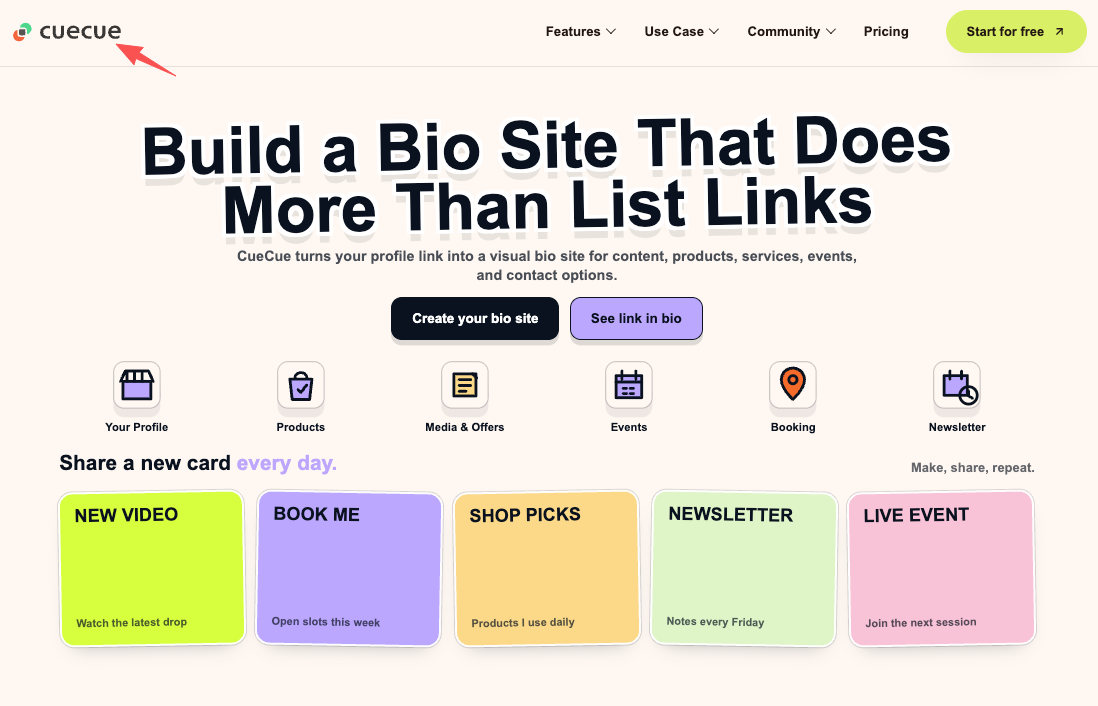
Take a tool like CueCue, for instance. You can literally steal their setup: they drop a proof line, a quick video, one CTA, a product card, and a basic form onto a single link-in-bio card. No matter what software you end up using, just stick to the golden rule—one card, one single action.
Common mistakes after faceless video views
I've made most of these, so here's where MoneyPrinterTurbo creators tend to lose the views they worked for.
The first is sending everyone to a generic profile. A profile is a hallway, not a room — people mill around and drift back out. Give them a door instead.
The second is stacking CTAs. When a page asks for a follow and a subscribe and a purchase and a download all at once, the viewer picks the easiest option, which is leaving. Pick one ask and protect it.
Then there's pointing the link somewhere that quietly breaks platform rules. If you route viewers to a sketchy site that breaks platform rules, say goodbye to your link privileges. YouTube is notoriously strict about their external link policies, and honestly, that same caution applies to TikTok and IG too. Always double-check the current guidelines before dropping a new URL in your bio.
The one that still stings is letting the page rot. I once left an old rate on a page and a link to a freebie I'd already taken down, and didn't catch it until a viewer pointed it out. Open yours now and tap every button the way a stranger would.
FAQ
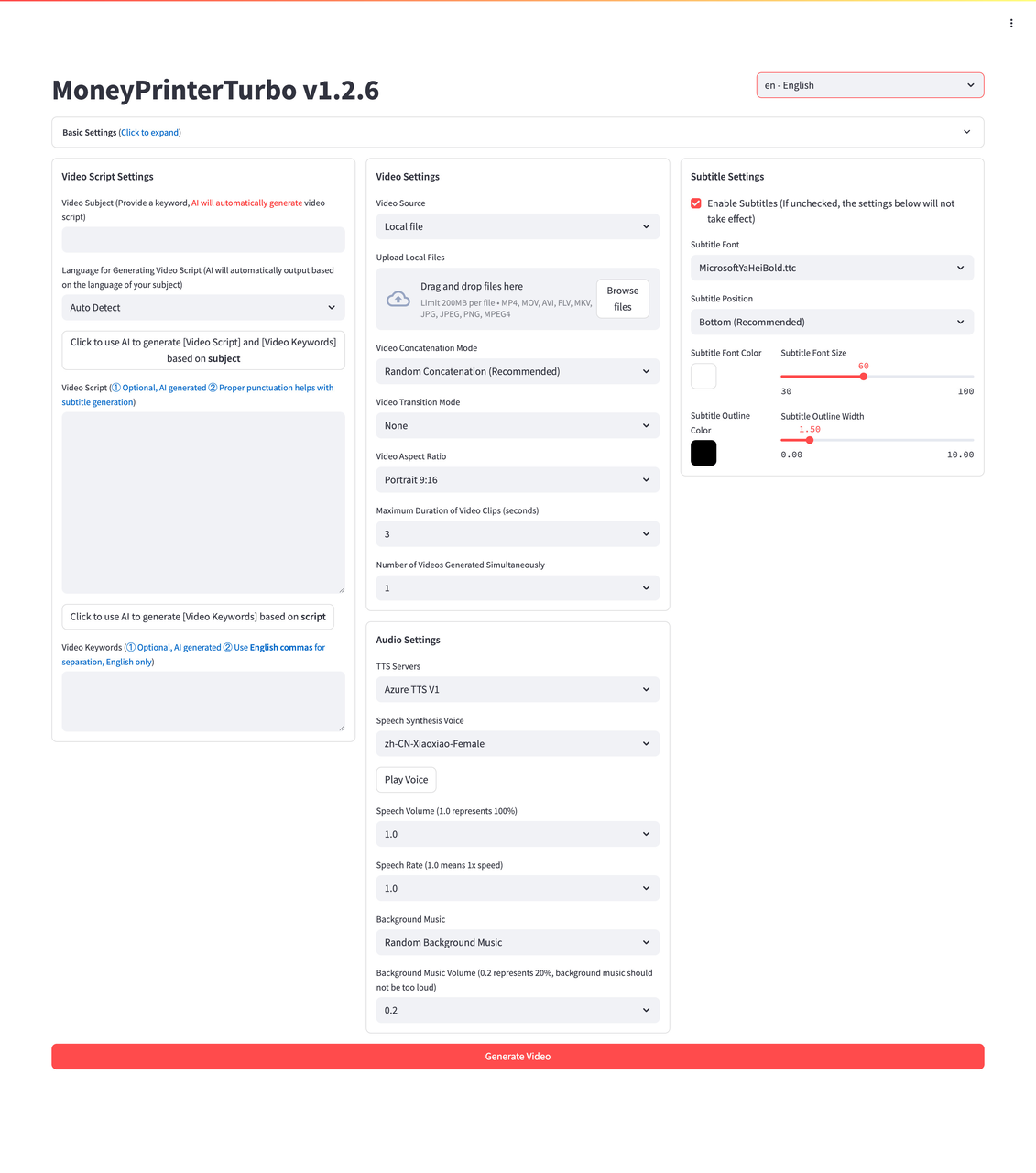
What is MoneyPrinterTurbo used for?
It’s a free, open-source script that fully automates faceless videos. Give it a keyword, and it handles everything—script, voiceover, B-roll, captions, and music.
Think of it strictly as a production engine. It can't capture leads or build your audience, which is exactly why you need to pair it with a landing page. (Quick tip: Always check their official GitHub for the latest commercial use rules. Don't trust your monetization to random Reddit threads.)
Do faceless video creators need a separate page for each video?
No. One page that you keep current almost always beats a pile of one-off pages you forget about. If you run very different campaigns, say a course launch versus an ongoing service, a second focused page can earn its keep. Honestly though? Most faceless channels only ever need one solid landing page focused on a single goal. Just build one to start. You can always expand later if your traffic genuinely outgrows it.
What should creators put on a landing page after a video?
Keep it focused on one single goal. A high-converting page really only needs three things:
- A quick proof of work.
- A tiny bit of context tying back to your video.
- One massive, impossible-to-miss CTA.
You can toss in a product card or an email form if that’s your play, but stop there. Cut any fluff that doesn't drive a click. If you're stuck on the CTA, just ask yourself: What’s the one phone notification I want to wake up to tomorrow?
When is a link in bio page better than sending viewers to a profile?
Almost always, when your goal is action. Your platform profile basically just shows people who you are, but a solid link-in-bio page actually tells them what to do next. If you leave your profile bare, viewers have to hunt for your stuff—and trust me, they won't. They'll just leave. The second you decide you want actual bookings, emails, or warm leads instead of just more followers, a dedicated landing page is the only way to go. Then point your one clickable profile link straight at it.
Your one move today
Open a simple page tool, put one proof line, one CTA, and a short form on a single card, and drop that link into your channel profile. Don't make it pretty yet — make it work. Then point your next MoneyPrinterTurbo video at it. The clips are already earning the attention; this is just turning every share into an action. Go build the one page your traffic deserves.
About this content
- Written by
- Mia Anderson, UGC Creator · Content Creator
- Reviewed by
- CueCue Team, Editorial review desk
- Last updated
- June 9, 2026
- Editorial standard
- CueCue articles are written for practical use, checked for clear sourcing, and updated when product or policy details change.