
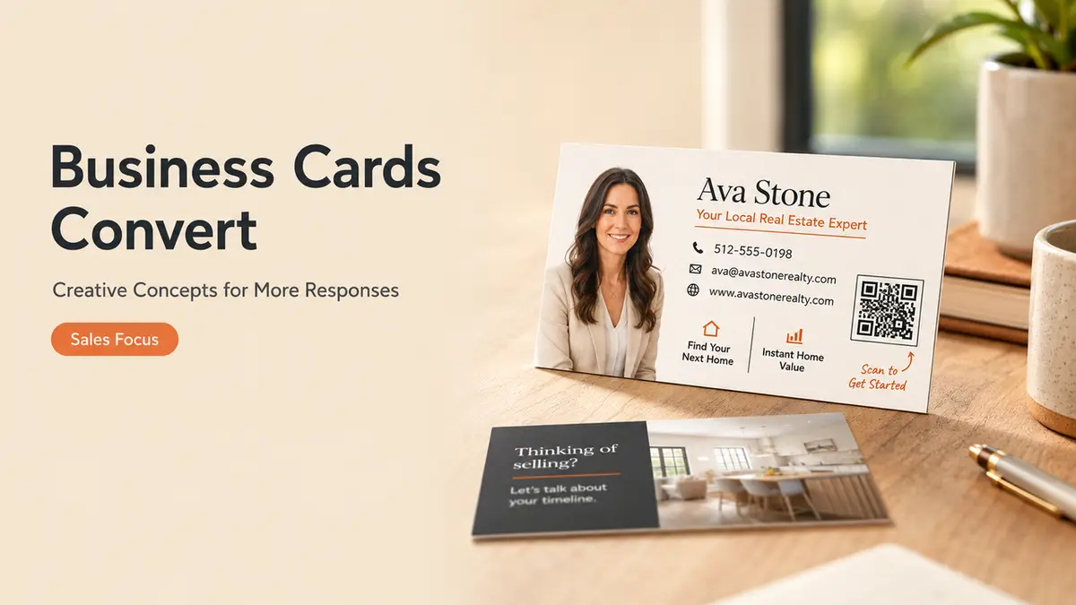
Hi, I am Mia. My first creator link page looked busy in a very polished way. Seven matching buttons. Nice icons. Not one of them said, “Work with me.”
I had spent time making the page look finished and almost none making the next step obvious. Creative real estate business cards can fall into the same trap. The stock feels expensive, the layout gets compliments, and the recipient still has no idea why they should keep it.
Creativity should help someone remember the conversation and continue it. That is the standard.
What Makes Creative Real Estate Business Cards Useful
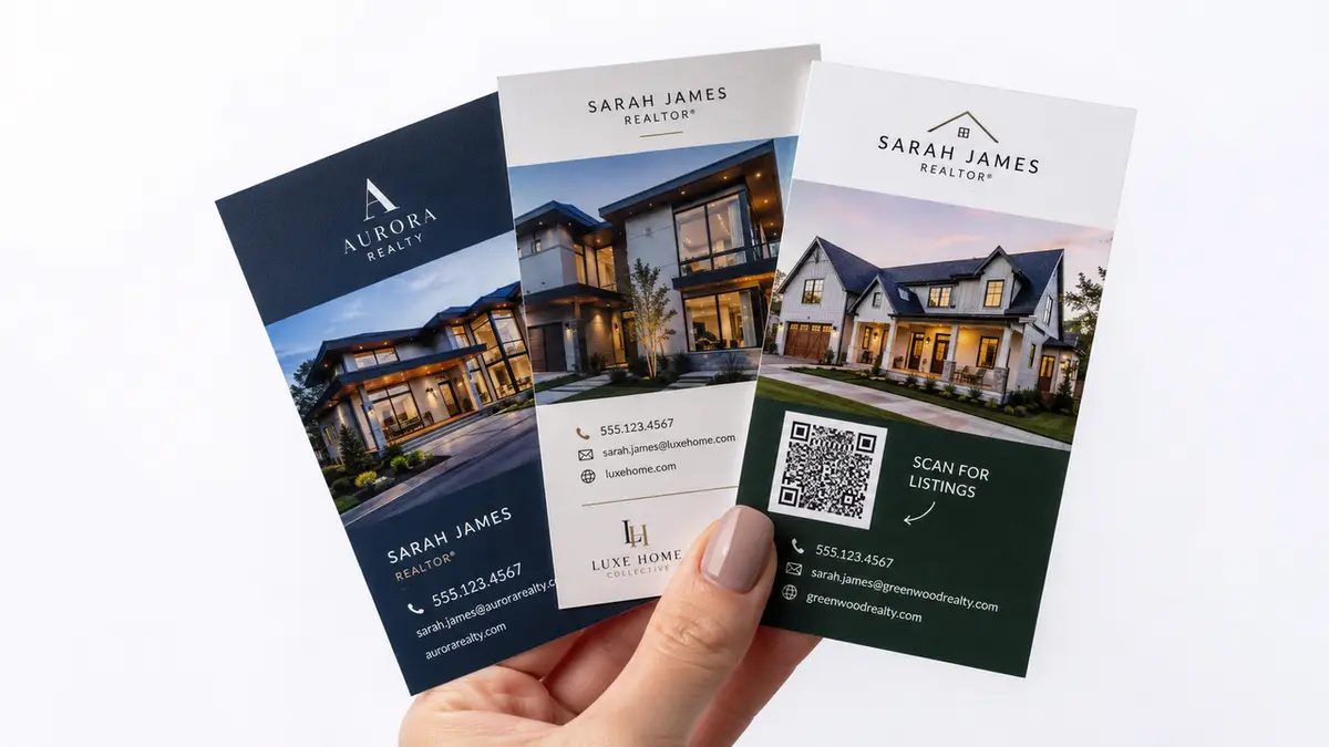
A useful card does not need to look predictable. It can use a bold crop, an unusual paper texture, a local illustration, or a back panel that feels more like a tiny invitation than a contact sheet.
The hierarchy still has to work.
Your name and professional role should be easy to find. The brokerage identity and any locally required disclosures need enough space to remain readable. Then the card needs one clear reason to call, scan, or save your information.
Most realtor business card ideas begin with finishes, fonts, or shapes. Start with the handoff instead.
A few choices carry more weight than another decorative element:
- Use one visual idea.
- Give the QR code a label.
- Keep a visible phone number or short URL as backup.
- Match the design to the moment when you hand it over.
A neighborhood farming card should not read like an open house card with the address removed. A referral card has a different job again.
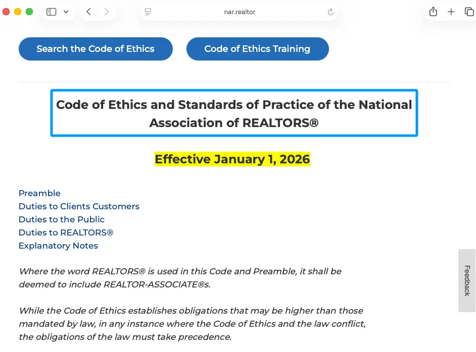
For REALTORS®, NAR’s 2026 Code of Ethics says advertising should present a true picture, and credentials should only appear when the person is entitled to use them. Creative copy still has to be accurate.
Creative Real Estate Business Cards by Use Case
The design gets easier once you choose the moment the card needs to survive. Do not begin with a font. Begin with the handoff.
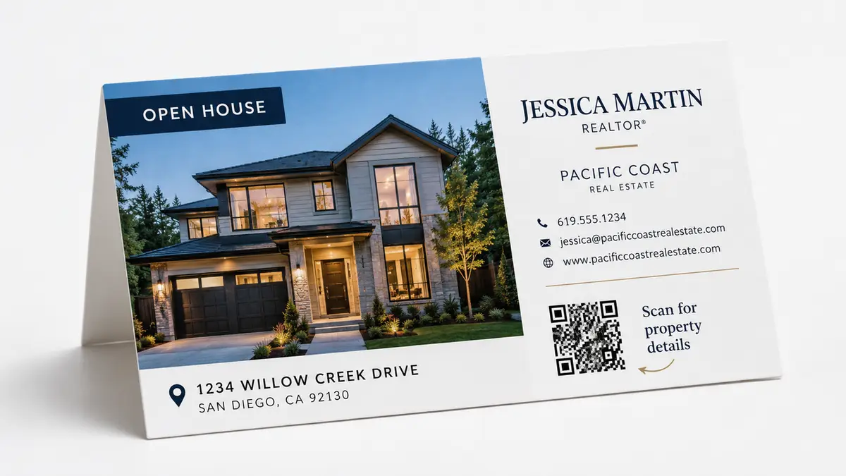
Open House Handout
An open house card can feel specific without becoming disposable.
Use the property as the visual anchor: one strong image, the address, and a small line explaining what the QR code opens. The back can hold your contact details and a simple invitation.
Questions after the tour?
Scan for property details, similar homes, or a private follow-up.
The visitor already knows you work in real estate. They need help continuing this conversation.
The page behind the code can show the property, your role, and a few relevant choices. Keep them close to the visit: ask about the home, view similar listings, or share a buying timeline.
No confetti required.
If the property closes, the card does not have to become dead paper. Keep the same QR destination and replace the listing with nearby homes, an area guide, or a general consultation path.
Neighborhood Farming Card
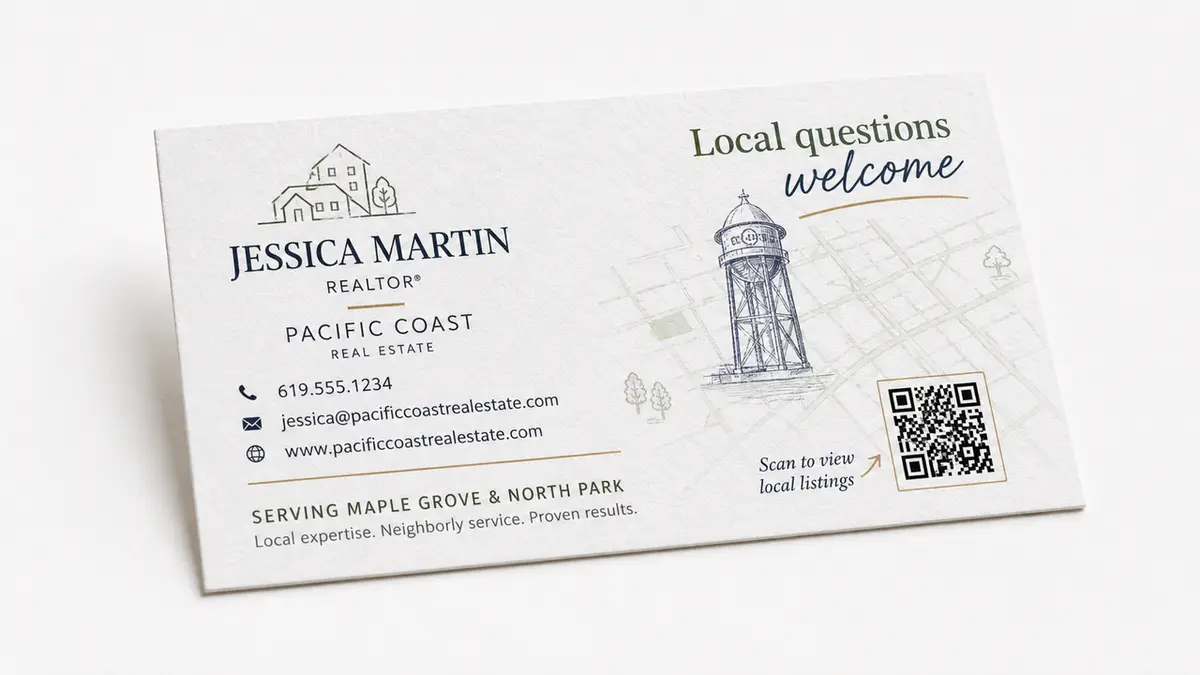
A farming card earns attention by being locally recognizable. That may come from a simple street grid, a line drawing of a familiar landmark, or a color taken from the neighborhood.
The creative element should say, “I work here.”
Planning a move in [Neighborhood]?
Scan for current listings and a local seller checklist.
Avoid claims that sound larger than the evidence behind them. “The neighborhood’s number one agent” needs reliable support and may also raise brokerage or regulatory concerns. A plain service-area statement is often stronger.
Real estate sayings for business cards can work when they sound like something you would actually say. “Local questions welcome” does more work than a familiar quote about home being where the heart is.
Referral Follow-Up Card
A referral card should make forwarding easy.
A generic real estate card handed off with "pass this along" isn't doing you any favors. If you're relying on referrals — and most agents are — the card itself should feel like it was made for the person holding it, not just printed in bulk and distributed.
Referred by someone you trust?
Scan to see how I work and send a quick introduction.
This design can be quieter than an open house card. A clean headshot or your logo, some breathing room on the layout, and a message that isn't pushing them to "call now" — that's the combination that actually holds up. A lot of referral cards fail because they're written for someone who's already decided. Most people aren't.
The QR destination only needs a short profile, service area, contact choices, and one low-pressure form. Ask how the person was referred and what they are considering. Then stop.
Where QR and Digital Cards Fit
A QR business card connects fixed print to information that can change. The printed card keeps its visual identity, while the digital real estate card behind it can carry current listings, booking, contact details, or an inquiry form.
CueCue confirms that a digital business card can sit behind a printed QR code and include services, contact actions, booking, testimonials, listing links, and one follow-up CTA. The same link can remain active while the content changes.
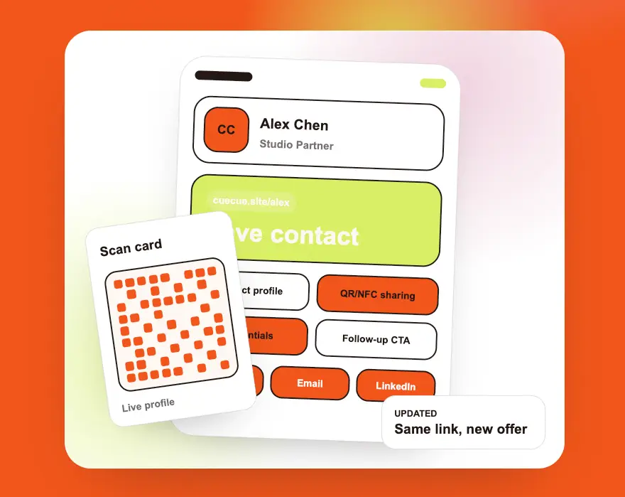
That separation helps the design breathe. The paper does not have to hold every fact. It only has to create recognition and earn the scan.
Think about the person who pockets the card and scans it three days later, maybe on a lunch break. They should be able to figure out who you are, why someone passed this along, and what they're supposed to do on the page — without any context from the original conversation. That's a higher bar than most people design for.
Starting from a template makes it easier to hit. CueCue has a library of digital card and lead-capture templates you can reshape by section, color, links, and CTA rather than building everything from scratch. Its templates can also serve as focused destinations for QR campaigns.
For a real estate card, keep the digital page in this order:
- Name, role, brokerage, and service area.
- One sentence about the client or situation you help with.
- The main action, such as asking a question or requesting a call.
- Supporting proof and listing links farther down.
CueCue also supports forms, booking modules, and lead capture inside its interactive card builder, so a scan can lead to a response instead of another page full of links.
Risks: Clever Design That Weakens Contact Clarity
Clever cards often fail in small, ordinary ways.
The type is too thin. The QR code sits on a patterned background. The phone number is hidden on an edge that looked great in the mockup. A die-cut roof catches on everything in a wallet.
Print one copy first.
Before you call it done, pull back and actually look at it like you've never seen it before — which is hard when you've been staring at it for an hour. Better move: hand it to someone who had nothing to do with making it and just ask what they'd do next. Then scan the QR code on a couple of different phones. Try it inside, try it outside. Lighting changes more than people expect. Then check the mobile page with the same care.
Compliance details need the same test. Rules differ by state and brokerage. California, for example, treats certain business cards and other first-contact materials as advertising that may need specified license and responsible-broker information under its real estate advertising guidelines. Texas publishes separate business-card advertising requirements through TREC.
Check the rules that apply to you before the design goes to print. A beautiful card with missing required information is not finished.
The best creative real estate business cards do not make people admire the design and then wander off. They make the agent easier to remember and the next action easier to take.
Your one move today: choose the exact handoff your card is built for, then remove any design element that does not help that person contact, scan, or inquire.
FAQ
Can creative cards still look professional?
Yes. "Professional" gets used as an excuse for boring design more often than it should. You can have one strong visual idea and still look credible — just don't let it trample the contact details or push out the brokerage and license info you're required to include. That stuff needs to stay visible.
Should real estate cards include photos?
A headshot can help after open houses and community events. Property photography works better when the card supports one listing or location. Use an image only when it helps the recipient remember the meeting.
How should agents test business card ideas?
When it's ready to go to print, don't proof it at 60% zoom on your laptop. Print one at actual size. Scan every QR code — not just the main one. Pull up the linked page on your phone and see how long it actually takes to find the contact action. Then ask someone who's never seen the design to do the same thing. And wherever this card is going to be handed out, test it there. A card that works fine under your office lights can feel completely different at a networking event.
About this content
- Written by
- Mia Anderson, UGC Creator · Content Creator
- Reviewed by
- CueCue Team, Editorial review desk
- Last updated
- July 3, 2026
- Editorial standard
- CueCue articles are written for practical use, checked for clear sourcing, and updated when product or policy details change.