Choosing a digital business card platform sounds easy until every option starts using the same words.
Mobile-first. Smart cards. QR ready. Team friendly. Free plan.
Cute. Also not enough.
What you actually need is a checklist that makes the decision less emotional. Not “Which app looks best?” Not “Which homepage has the shiniest mockup?” The better question is: can this platform handle the way people will actually share, update, scan, save, and respond to your card?
That is what this checklist is for.
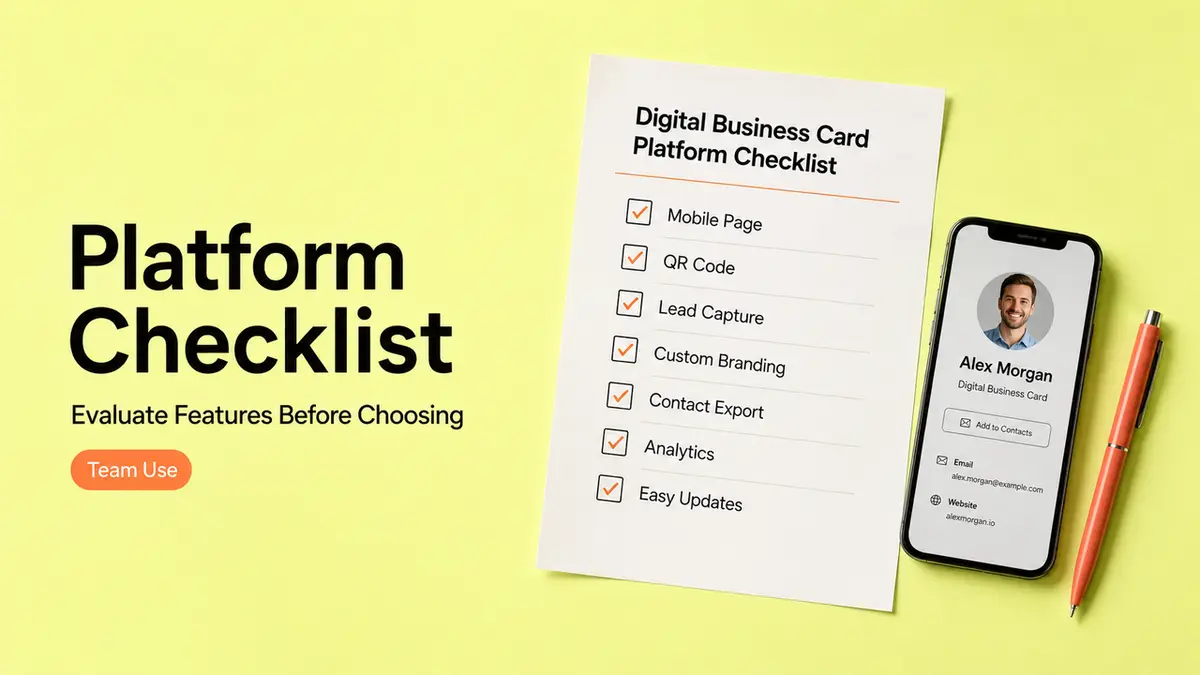
Platform Checklist
Use this as a practical filter before you compare digital business card software or sign up for a free digital business card app.
| Checklist area | What to look for |
| Mobile page quality | Fast, clear, easy to tap |
| QR and link sharing | Editable destination, clean QR, short public URL |
| Forms and lead capture | Inquiry paths, booking links, export or routing |
| Update flexibility | Easy edits after cards are shared or printed |
| Team controls | Ownership, roles, shared structure, handoff |
| Exit path | What happens if you leave later |
I would not score every feature equally. A beautiful card with weak update control is risky. A free plan with no useful lead capture may be fine for personal networking, but not for campaign follow-up.
Start with the workflow.
Then judge the platform.
Mobile page quality
A digital business card is usually opened on a phone, so the mobile page matters more than the desktop editor.
The first screen should answer three things quickly:
- Who is this?
- Why should I care?
- What should I do next?
That sounds basic because it is. Still, this is where a lot of cards get messy. They stack every social link, every offer, every logo, every button, and somehow the actual contact path gets buried.
I would test the mobile page with one thumb.
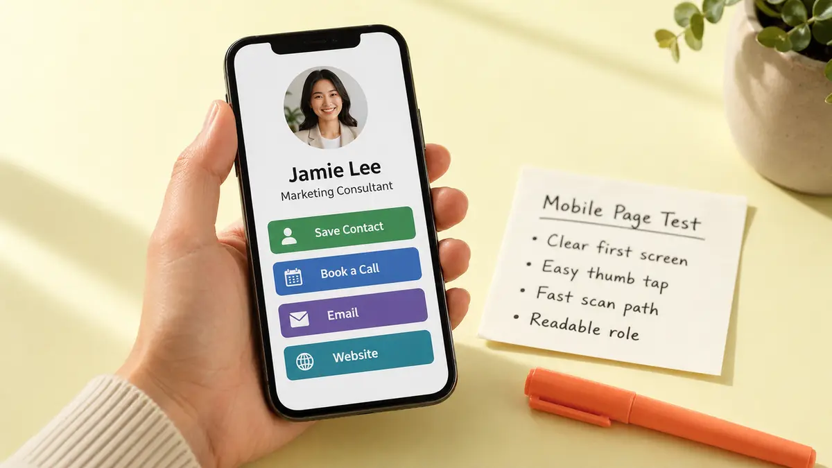
Can you tap the main button easily? Can you read the role without zooming? Does the card load before the moment gets awkward? If the platform lets you add too much, that is not always a gift.
For accessibility, W3C’s WCAG 2.2 says pointer targets should be at least 24 by 24 CSS pixels, with exceptions. For a business card page people open from QR codes, events, or email signatures, I would go larger.
Tiny buttons are not a design choice. They are a lost lead waiting to happen.
QR and link sharing
A QR business card platform should treat the QR code as part of the workflow, not as an afterthought.
Check whether you can:
- Download the QR in print-friendly formats
- Keep one stable public URL
- Update the destination later
- Preview the mobile scan path
- Use the same link in email, social bios, and printed materials
- Avoid rebuilding the QR every time a card changes
QR codes can store different amounts of data depending on version and data type. DENSO WAVE’s QR Code version guide explains that more data creates a larger, denser symbol.
Normal-person translation: point the QR to a clean URL. Do not cram the whole card into the code if a live page can do the job better.
For CueCue-style cards, this is the whole point: one shareable mobile card can hold contact paths, booking links, forms, offers, videos, and QR sharing. The QR opens the door. The page handles the action.

Forms and lead capture
A card that only saves contact details can be enough for casual networking.
For sales, services, events, local business, or creator work, you may need more.
Look for lead capture that fits the way people actually respond:
- Short inquiry form
- Booking link
- Email button
- Phone or text option
- RSVP path
- Offer or product interest form
- Export or notification flow
Please do not make the form a tiny job application.
If the card is for a coach, maybe three fields are enough: name, email, goal. If it is for a salon, booking may matter more than a message box. If it is for a real estate agent, phone and property interest may beat a long contact form.
The platform should help you ask for the next useful detail, not every possible detail.
Update flexibility
This is the part people ignore until something breaks.
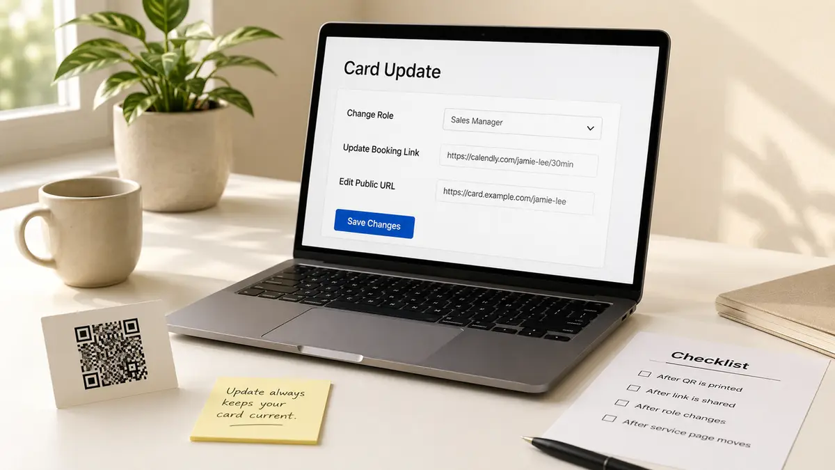
Can you change the card after the link is shared? After the QR is printed? After an employee changes roles? After a service page moves? After your booking tool changes?
A digital business card platform should make updates boring.
Boring is good here.
For contact files, vCard still has a place. The RFC 6350 vCard specification covers address book information like names, phone numbers, email addresses, photos, logos, and URLs. Great for saving someone.
But if the card needs forms, booking, campaign links, lead capture, or team routing, a live page gives you more room to fix things later.
My rule: if the card will be printed or widely shared, the destination should be editable.
Team controls
Even if this page is not a small-team buying guide, team controls still belong on the platform checklist.
Why? Because a “personal” card system gets messy the moment two or three people use it for the same business.
Check for:
- Shared branding
- Role or permission settings
- Card ownership
- Easy employee handoff
- Consistent card templates
- Redirect or archive options
- Lead routing
- Export access
- Brand-safe link control
This matters even if you are small.
Actually, especially if you are small. Small teams rarely have someone cleaning up old links every Friday afternoon with a cheerful spreadsheet and unlimited patience.
If a team member leaves, the business should still control the card destination, lead flow, and public details.
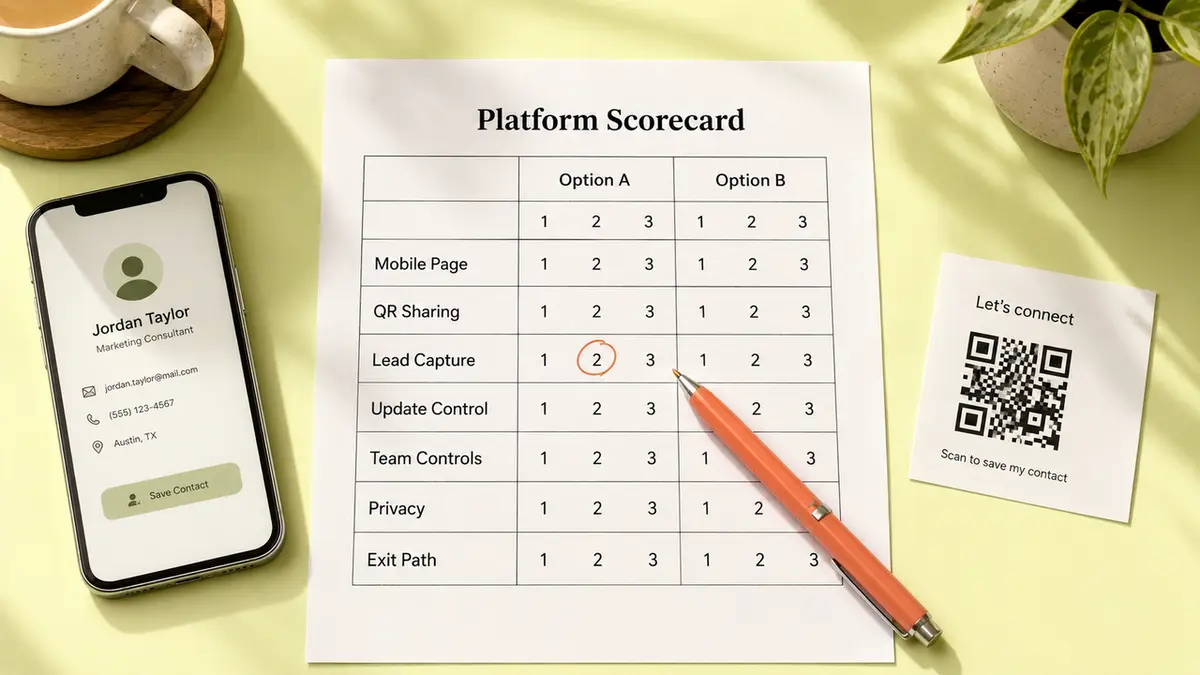
How to Score Your Options
Do not score a digital business card platform by feature count.Score it by fit.
Use a 1 to 3 scale for each category:
| Score | Meaning |
| 1 | Weak or unclear |
| 2 | Works with manual effort |
| 3 | Fits the workflow cleanly |
Then score these areas:
- Mobile page quality
- QR and link sharing
- Forms and lead capture
- Update flexibility
- Team controls
- Free-plan fit
- Privacy and public detail control
- Exit path
A free plan can score high if your use case is simple. A paid plan can score low if it creates work your team will not maintain.
The question is not “Which platform has the most?” It is “Which platform removes the most manual cleanup from the workflow I actually have?”
That answer changes by use case.
Good. Let it.
What This Checklist Does Not Decide
This checklist does not decide which tool is the best.
It also does not decide whether you need a full website, a CRM, a link in bio page, or a printed card strategy. Sometimes you do. Sometimes you do not.
It does not compare live pricing, because pricing changes. It does not judge every digital business card app by the same feature list, because a freelancer, a salon, an event host, and a sales team do not need the same thing.
It also does not replace testing.
A card can look perfect in the editor and feel annoying on a phone. A QR code can look sharp on screen and scan badly when printed too small. A form can seem reasonable until customers stop halfway through it.
You still need to try one card in the real world.
Sorry. I would love to make that less true.
Limitations and Trade-Offs
Every platform choice has a trade-off.
A simple card is easier to maintain, but may not support forms or team controls. A richer card can handle lead capture and campaign links, but someone has to keep it clean. A free digital business card app may be enough for one person, but awkward for shared branding or staff handoff.
Privacy matters too.
The FTC’s Protecting Personal Information guide recommends collecting and keeping only what your business actually needs. That is a useful mindset for public cards. Do not publish personal phone numbers, home addresses, private calendar links, or internal documents just because a template has a field for them.
And think about leaving.
If you stop using the platform, can you export contacts? Can you redirect links? Can printed QR codes keep working? Can you rebuild the card somewhere else without losing the public path people already have?
Not exciting.
Very worth asking.
Conclusion
A digital business card platform should make your card easier to share, update, scan, and act on.
That is the bar.
Look past the pretty templates for a minute. Check the mobile page, QR workflow, forms, update control, team ownership, privacy defaults, and exit path. Then test one real card before you commit.
Your one move today: score your top two options against this checklist before you compare another pricing page.
FAQ
When is a simple bio page enough?
A simple bio page is enough when you only need to share a few links and do not care much about contact saving, QR printing, lead capture, or team handoff. If the goal is “see my links,” keep it simple. If the goal is “book, inquire, RSVP, or save contact,” use a stronger card setup.
What should I ask before importing contacts?
Ask where the contacts will be stored, who can access them, how exports work, and whether you can delete them later. Also ask whether you really need to import contacts at all. For many small workflows, a form notification or export is enough.
How do I compare tools when pricing changes?
Compare workflows first, pricing second. Write down the features you actually need: number of cards, QR editing, forms, branding, analytics, team access, exports, and support. Then check current pricing pages last. That keeps you from buying a plan for features you will never touch.
Should I test one card before rollout?
Yes. Build one real card for one real use case. Put it in an email signature, scan the QR from a phone, submit the form, test the booking link, and ask one person outside your team to use it. You will find issues faster than you expect.
What happens if I leave the platform later?
Ideally, you can export leads, save card copy, redirect important links, and replace printed QR destinations without a mess. If a platform locks the public URL, contacts, or QR flow too tightly, leaving later may be painful. Ask about the exit path before rollout.
About this content
- Written by
- Mia Anderson, UGC Creator · Content Creator
- Reviewed by
- CueCue Team, Editorial review desk
- Last updated
- July 9, 2026
- Editorial standard
- CueCue articles are written for practical use, checked for clear sourcing, and updated when product or policy details change.