Mia here. I once booked a web designer and a two-week timeline to build my whole site. Pages for everything I did. Then a brand messaged asking where to send a brief, and it hit me: I didn't need a site. I needed one page that did one job.
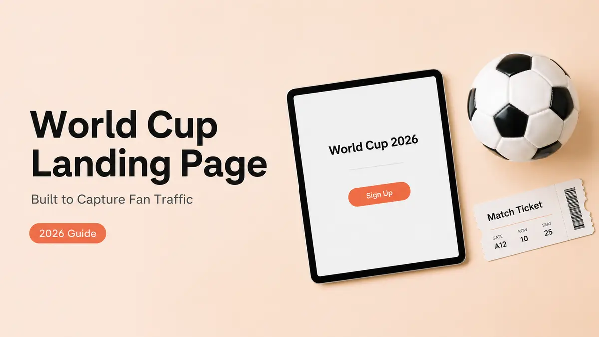
That's the trap with FIFA 2026 traffic too. A wave of new fans shows up, and most pages let them wander right back out. This walks through how to build a focused World Cup landing page around a single goal, so fan traffic actually turns into a signup, an offer claim, a booking, or an inquiry.
Why a World Cup 2026 landing page needs to focus fan traffic
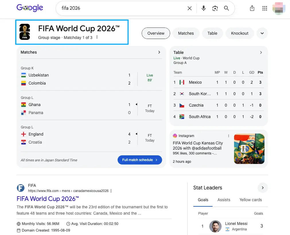
Tournament attention is a flash flood. It comes fast. It arrives huge and it drains just as quickly once the final whistle blows and everyone scatters back to whatever they were doing before the match pulled them in. The question isn't whether you'll get fan traffic. It's whether any of it does something before it's gone.
Here's the reframe that changed how I build these. A page that lists everything you do gives a visitor nothing to actually do. Choice is friction. When someone lands hot off a match clip, every extra option is a small reason to bounce, and most of them will.
So the job of the page isn't to impress. Far from it. It's to move one specific person toward one specific action, and once you know exactly who that person is and what you want from them, the rest of the page basically designs itself. Decide that first.
Choose one conversion goal before building
This is the step almost everyone skips, and it's the whole game. Before you pick colors or write a headline, name the single thing you want a visitor to do. Just one.
Newsletter or fan community
If you're building something that outlasts the tournament, this is your goal. Capture an email or a group join, and you can reach those fans again in August when the hype's gone quiet.
The action is small and low-commitment, which suits cold tournament traffic. Someone who just found you won't book a call yet. They'll drop an email to "keep up with the takes." Make that the one ask.
Product, merch, or offer
Selling something tied to the moment? Then the goal is the click to buy or claim. A limited match-day bundle, a discount code, a drop you're running for the final.
Point everything at that one offer and link out to wherever checkout actually lives. One offer, one button. The landing page sets it up; your store closes it.
RSVP, booking, or sponsor inquiry
Maybe the goal is a real-world response: a table reserved, a slot booked, a brand reaching out. For sponsor interest specifically, give brands a clean inquiry path instead of a buried DM. If you post any paid partnership on the page, disclose it. The FTC's disclosure guidance explains doing that in plain language, where people will actually see it.
Page blocks that keep fan traffic moving
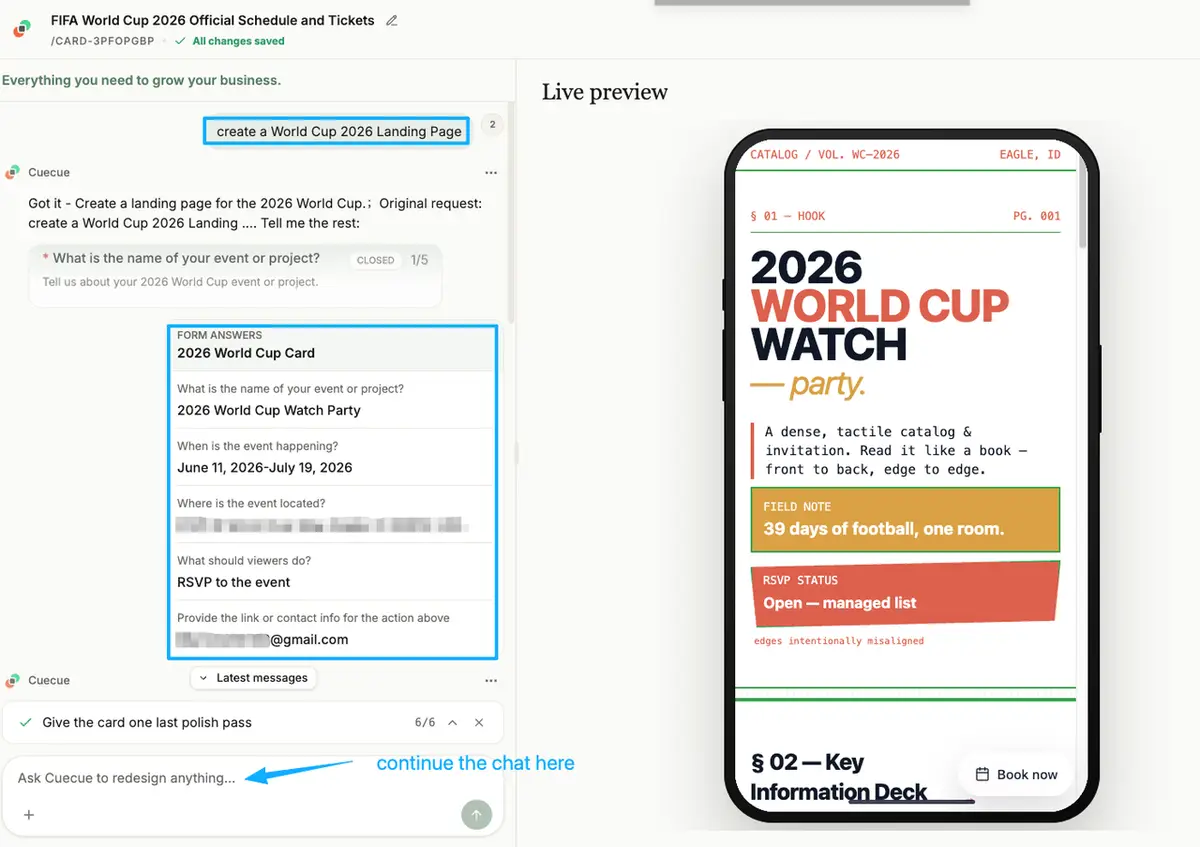
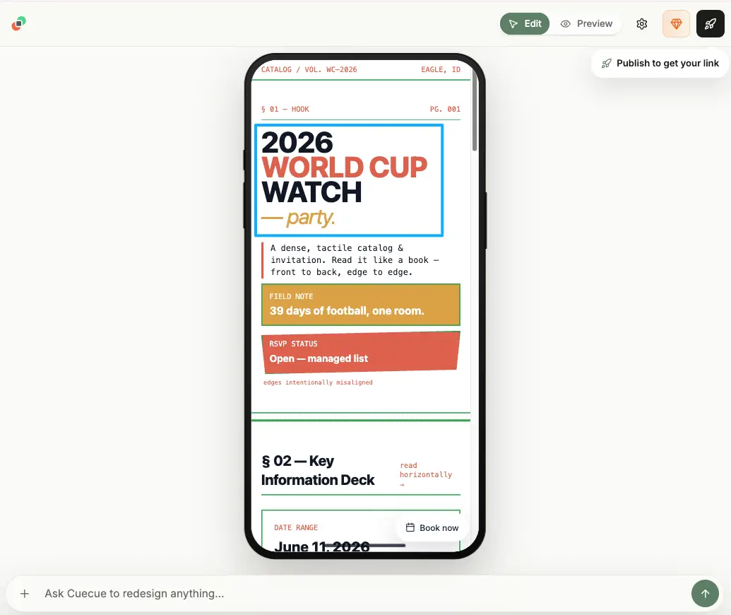
Once the goal is locked, the page is just a few blocks doing their job in order. Here's an example you could build, where a tool like CueCue is one way to put these on a single mobile page.
Clear offer section
Lead with the one thing. Not your life story. A short line on what they get, and why now, sitting right at the top where a thumb lands first.
Cold traffic decides in seconds. If the value isn't obvious in the first line, before anyone has to scroll or tap or think too hard about what you're even offering them, the rest of the page never gets read. Say it early.
Lead capture form
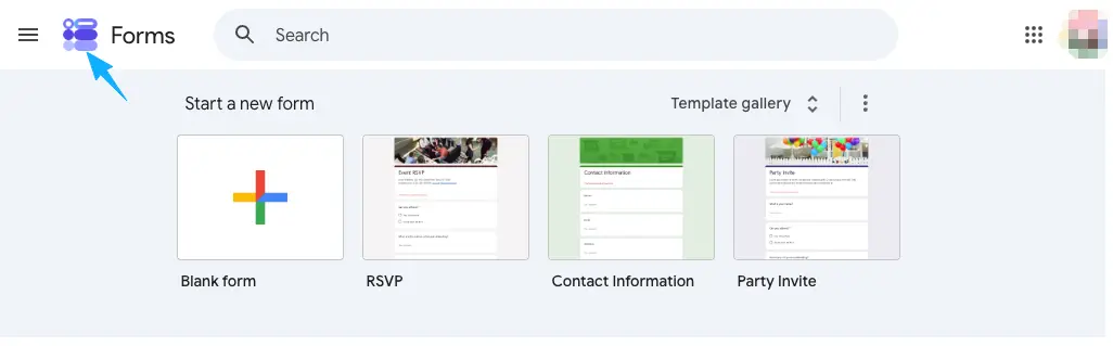
Keep it tiny. Name and one contact field is usually enough to start a real conversation, and every extra field shaves off responses. A short setup like a simple form in Google Forms does the basic job, or a built-in form on your action page keeps everything in one place.
A good lead capture page asks for the minimum and follows up fast. The form isn't the finish line; it's the start of the thread.
Link and contact options
Below the main action, give a quiet secondary path for people not ready to convert. A creator landing page can hold a contact button, your other socials, or a way back to your content. Just don't let these compete with the primary goal. They sit lower for a reason. Point your link in bio at this page so every new follower lands somewhere with a clear next step.
How a World Cup 2026 landing page differs from a general campaign page
A general campaign page tries to carry a broad push: multiple offers, several audiences, a bit of everything for a big launch. A fan-traffic page is the opposite. It's narrow on purpose, built for one surge of attention and one response.
That narrowness is the advantage. You're not running a quarter-long campaign. You're catching people who are excited right now, in the middle of a tournament everyone's watching, and handing them one easy thing to do before that attention drains away to the next match. Right now. That's the window.
One football-specific caution. Be careful with official tournament logos, emblems, trophy imagery, and team or player photos, since those sit behind protected marks and usage rules. You can talk about the matches in your own voice. For what's actually permitted, check FIFA's brand protection guidance and treat it as the source of truth, because it's enforced closely around the tournament.
One page, one job
Pick the single action you want fans to take this week. A signup, an offer, a booking, one inquiry path. Build the page around just that, point your bio and your posts at it, and let the rest wait. The tournament won't slow down for a perfect page, so ship the focused version today and refine it as matches roll on. Turn every share into an action, and one clear page will do more for your fan traffic than ten busy ones.
FAQ
What usually makes fans leave a World Cup landing page?
Too many choices, mostly. When a page offers five things at once, a cold visitor picks none and leaves. The other big one is a slow or unclear top section, where someone has to scroll and decode before they understand what they're being offered. Cut the page down to one obvious action and most of the leaks close on their own.
How should businesses follow up after fans submit information?
Quickly, and with the thing you promised. If they signed up for match takes, the first message should be a match take, not a sales pitch. Speed matters more than polish here, because a follow-up that lands while the tournament's still on gets opened, and one that shows up three weeks later mostly doesn't.
Can one page serve both fans and sponsors?
It can, as long as one goal stays primary. Lead with the fan action and tuck a small "work with me" or inquiry link lower on the page. Trouble starts when both get equal weight up top, because then neither audience knows what the page is really for.
When should a landing page connect to booking software?
Once you need managed slots, capacity limits, or confirmations, a lightweight form has hit its ceiling. A page collecting casual interest can stay simple. A page booking actual time slots should hand off to real scheduling, with the landing page as the front door that routes people there.
What official marks should fan pages verify before publishing?
Anything that looks official: tournament logos, slogans, the trophy, mascots, and team crests or player imagery. These are protected, and a page promoting an offer or sponsor counts as commercial use. Verify against the official guidance before publishing, and when unsure, use your own footage and generic football visuals instead of anything branded.
About this content
- Written by
- Mia Anderson, UGC Creator · Content Creator
- Reviewed by
- CueCue Team, Editorial review desk
- Last updated
- June 18, 2026
- Editorial standard
- CueCue articles are written for practical use, checked for clear sourcing, and updated when product or policy details change.